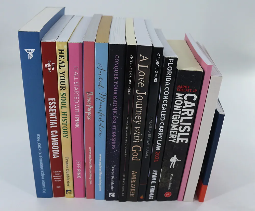

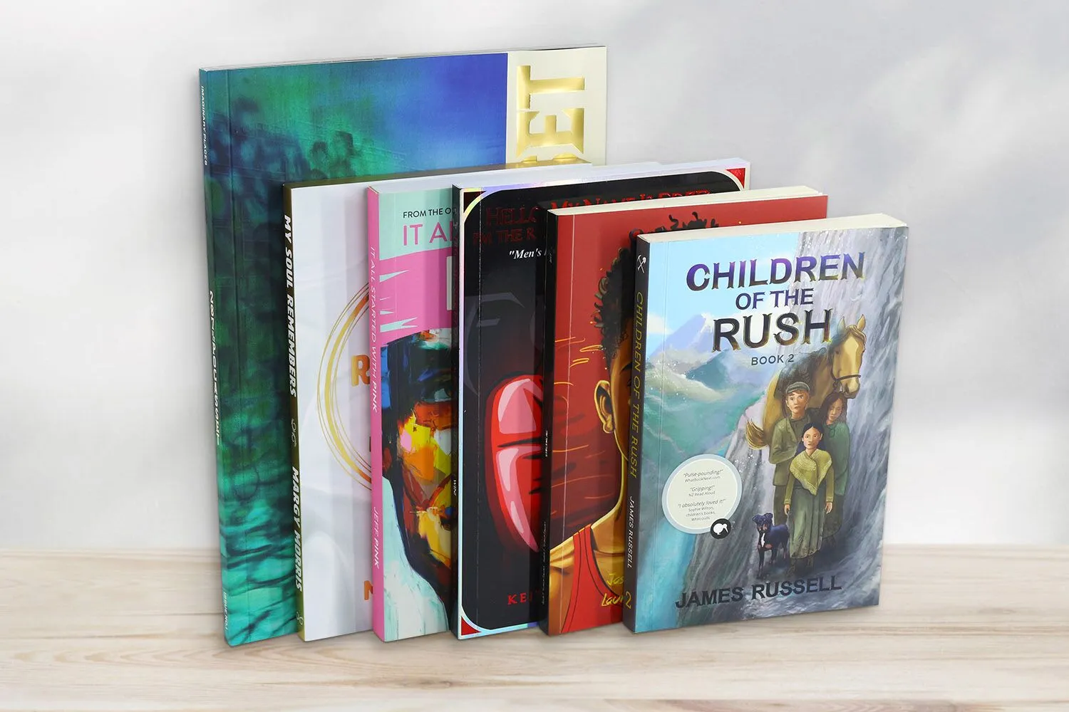
Paperback books remain one of the most popular formats in the publishing industry. From bestselling novels and children’s books to textbooks and magazines, paperback printing offers a practical and cost-effective solution for authors, publishers, and businesses alike.
While the interior pages of a book deliver the main content, the paperback cover is the first element readers notice. A well-designed cover not only attracts attention but also communicates professionalism and quality. Whether you are an independent author preparing your first book or a publisher planning a large print run, understanding how to properly design a paperback cover is essential for successful printing.
This guide will walk you through everything you need to know about how to design a paperback cover for printing, including cover layout, spine calculations, design steps, and a final checklist before sending your file to print.
What’s a Softcover Book Printing
Softcover book printing refers to books produced with a flexible paper cover instead of a rigid board cover. Softcover books are also commonly known as paperback books or softbound books. The cover is typically printed on thicker paper stock and laminated for durability.
Compared to hardcover books, paperback books are lighter, easier to carry, and more affordable to produce, which makes them extremely popular for many types of publications.
Common Uses of Paperback Books
Softcover books are widely used across the publishing industry. Some of the most common applications include:
Novels and fiction books
Children’s books
Educational textbooks
Workbooks and activity books
Instruction manuals
Catalogs and magazines
Comic books and graphic novels
Self-published books
Because of their versatility and lower production cost, paperback books are often the preferred format for mass distribution and retail sales.
Advantages of Softcover Book Printing
There are several reasons why publishers and authors choose to print softcover books.
Cost-effective production: Softcover printing typically costs less than hardcover production because it uses lighter materials and a simpler binding process.
Lightweight and portable: Paperback books are easier to carry and store, making them ideal for travel, reading, and educational use.
Flexible design options: Softcover books allow a wide range of customization options, including various paper types, sizes, and special finishes.
Faster production time: Because the manufacturing process is simpler than hardcover binding, softcover books can often be produced more quickly.
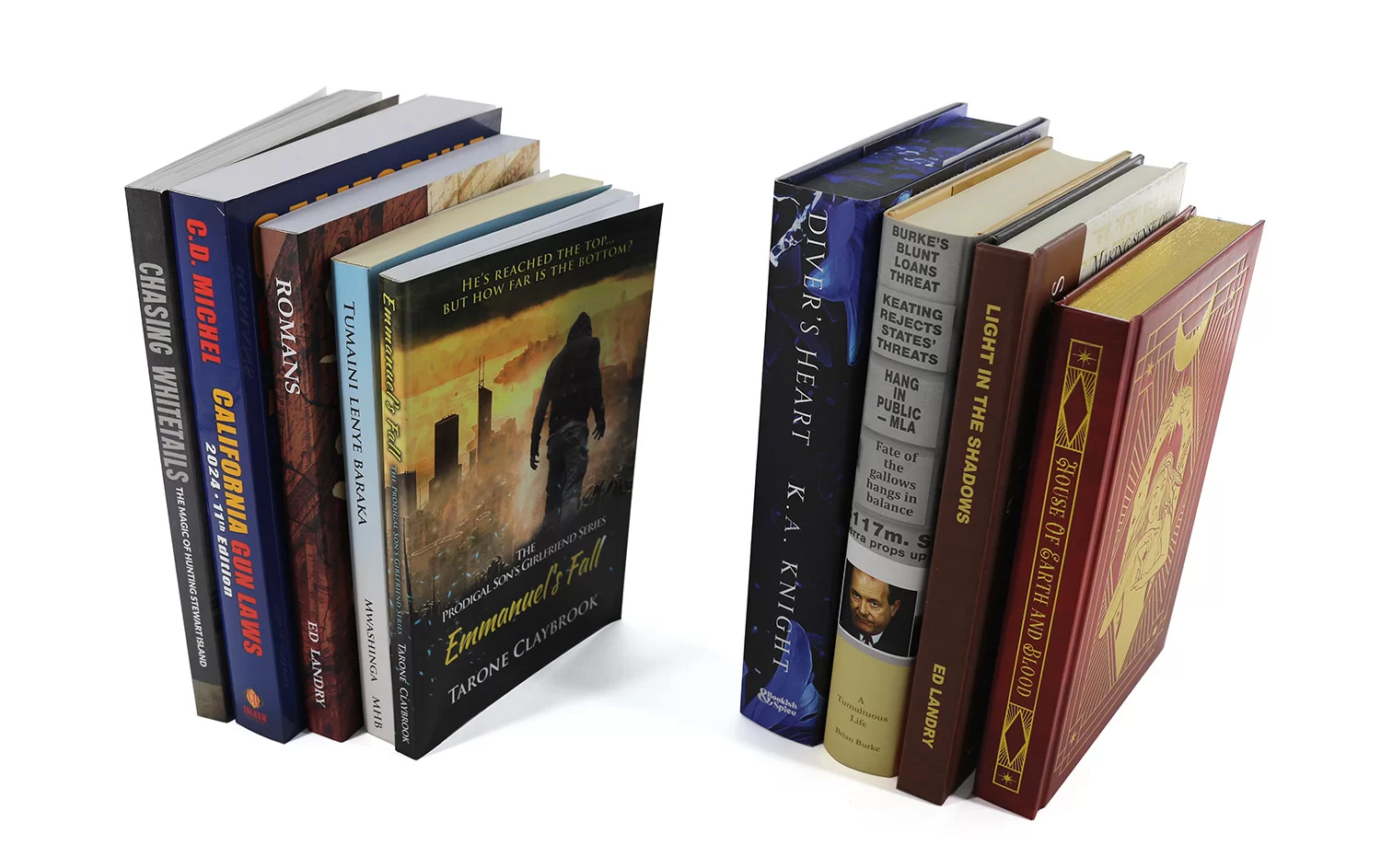
Binding Methods for Softcover Books
Several binding methods are commonly used in softcover book printing, each offering different levels of durability, flexibility, and appearance. The choice of binding depends on factors such as the book’s page count, intended usage, and overall production budget. The common used softcover binding methods include perfect binding, sewn perfect binding, and flexibound binding.
Perfect Binding
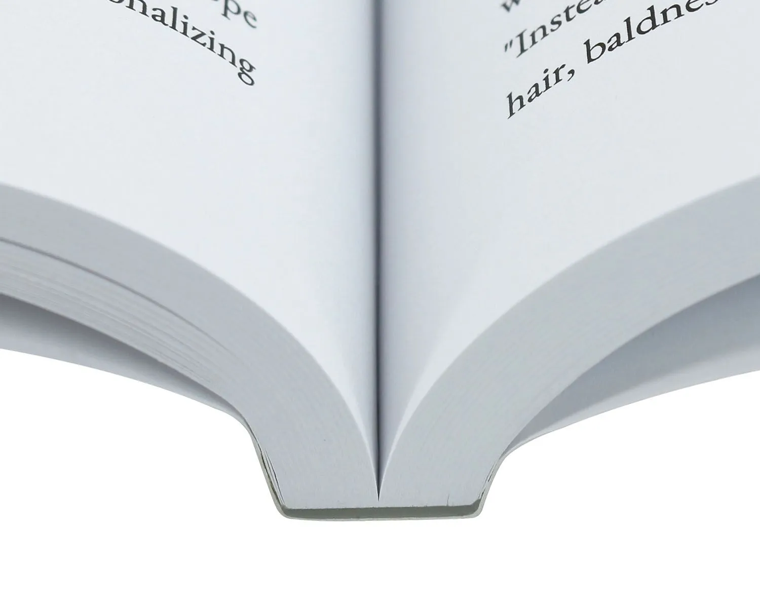
Perfect binding is the most common and widely used softcover binding method in the publishing industry. In this process, the interior pages are stacked together to form a book block, and the spine edge is trimmed and roughened before being glued with strong adhesive. The printed cover is then wrapped around the book block and attached to the spine.
This binding method creates a clean, flat spine, allowing the book title and author name to be printed on the spine for easy identification on bookshelves.
Perfect binding is widely used for a variety of publications, including:
novels and fiction books
catalogs and product guides
magazines and annual reports
corporate books and marketing materials
Because it provides a professional appearance while remaining cost-effective, perfect binding is often the preferred option for commercial publishing and self-published books.
Sewn Perfect Binding
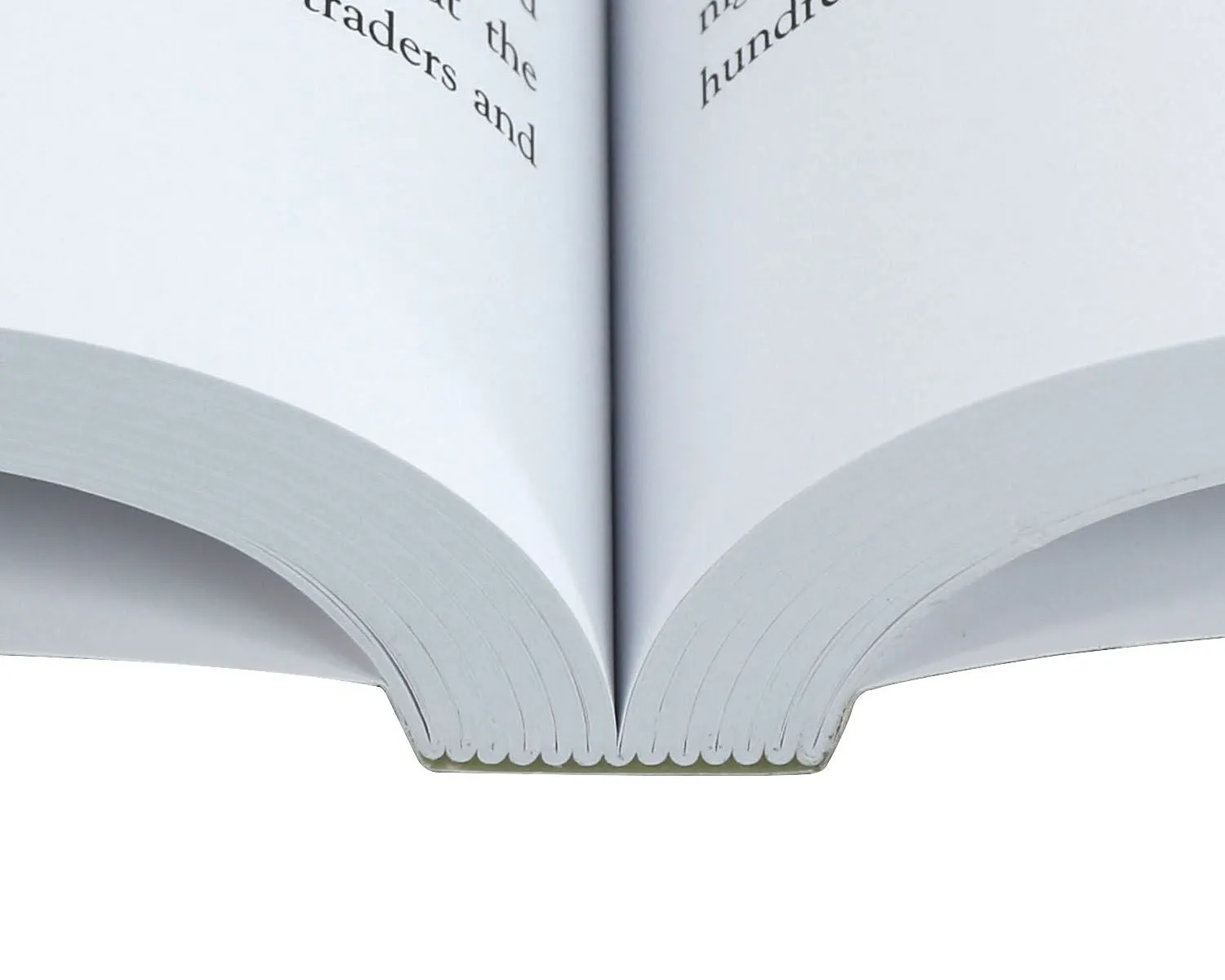
Sewn perfect binding combines traditional thread sewing with modern adhesive binding to create a stronger and more durable book structure.
In this method, the interior pages are first folded into signatures and sewn together with thread. The sewn book block is then glued into the softcover, similar to the perfect binding process. This extra sewing step significantly increases the durability of the binding.
Key advantages of sewn perfect binding include:
stronger binding durability
improved page flexibility
reduced risk of pages loosening over time
longer lifespan for frequently used books
Because of its enhanced strength, sewn perfect binding is often recommended for thicker books, textbooks, reference books, and publications designed for long-term use.
Flexibound Binding
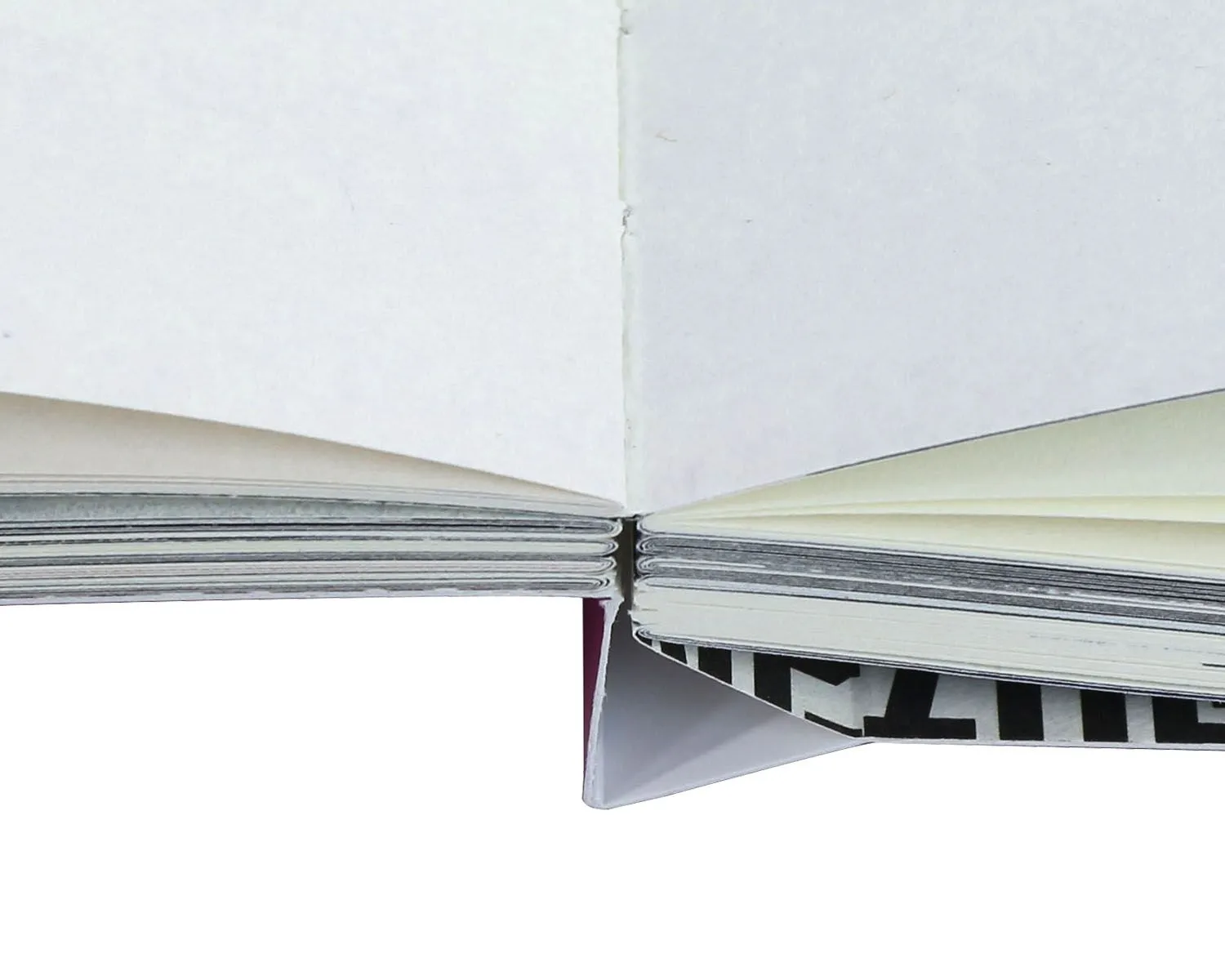
Flexibound binding is a hybrid binding style that combines elements of hardcover and paperback books. In this method, the interior pages are typically sewn together in signatures and then attached to a flexible cover. Unlike perfect binding, the spine area is not tightly glued, which allows the pages to open more smoothly and lie flatter when reading.
The cover material is more flexible than hardcover boards but still provides greater durability than a standard paperback cover.
Flexibound binding offers several benefits:
improved flexibility and comfortable reading experience
a more premium appearance than standard softcover books
stronger structure while maintaining a lightweight feel
Flexibound books are often used for:
Religious titles, such as bible books, prayer books
journals and planners
premium notebooks
gift books
Although this binding method is less common than perfect binding, it is often chosen for projects that require a balance between elegance, flexibility, and durability.
Standard Paperback Book Trim Sizes
Choosing the right trim size is an important step when preparing to print a softcover book. The trim size determines the final dimensions of the book after printing and cutting.
Different book genres often follow different standard sizes.
5″ × 8″: This is one of the most popular sizes for novels and fiction books. It is compact, easy to hold, and ideal for general reading.
5.5″ × 8.5″: A slightly larger format often used for: memoirs, non-fiction books, tradepaperbacks. This size offers a good balance between readability and portability.
6″ × 9″: The 6″ × 9″ trim size is extremely common for non-fiction publications such as: business bookx, self-help books, educational books and biographies. It provides more space for text and images while remaining comfortable to read.
8.5″ × 8.5″: Square formats are commonly used for children’s picture books because they allow more space for illustrations and creative layouts.
8.5″ × 11″: This larger size is typically used for: textbooks, instruction manuals, workbooks, educational materials, magazines. It allows plenty of room for diagrams, charts, and structured content.
While these standard sizes are typically more cost-effective for production and distribution, we also offer custom trim sizes to meet the specific requirements of your project.
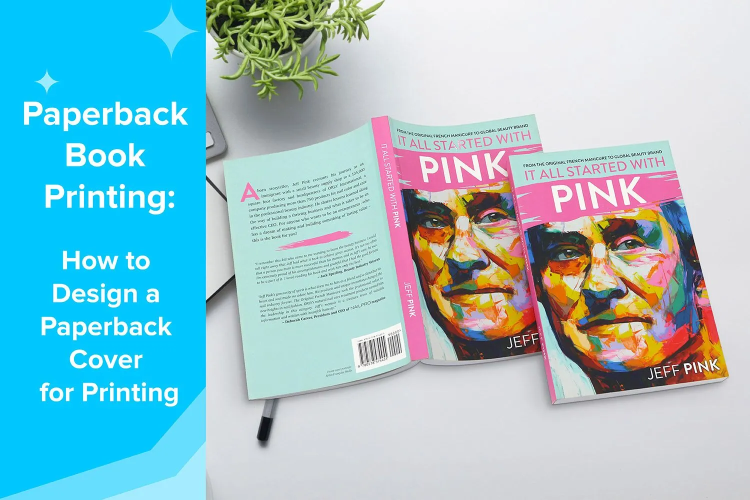
The Paperback Book Cover Size
When designing a paperback book cover for printing, it is important to understand that the entire cover must be prepared as one complete spread, rather than separate files for the front and back. This full cover layout includes the front cover, spine, back cover, and bleed areas in a single design file.
Because all of these elements are connected, the total cover size must be calculated accurately based on the book trim size, spine width, and bleed requirements. Properly setting up the cover file helps ensure that all visual elements align correctly during printing, trimming, and binding.
Each component of the paperback cover plays a specific role in both the visual appeal and functionality of the finished book.
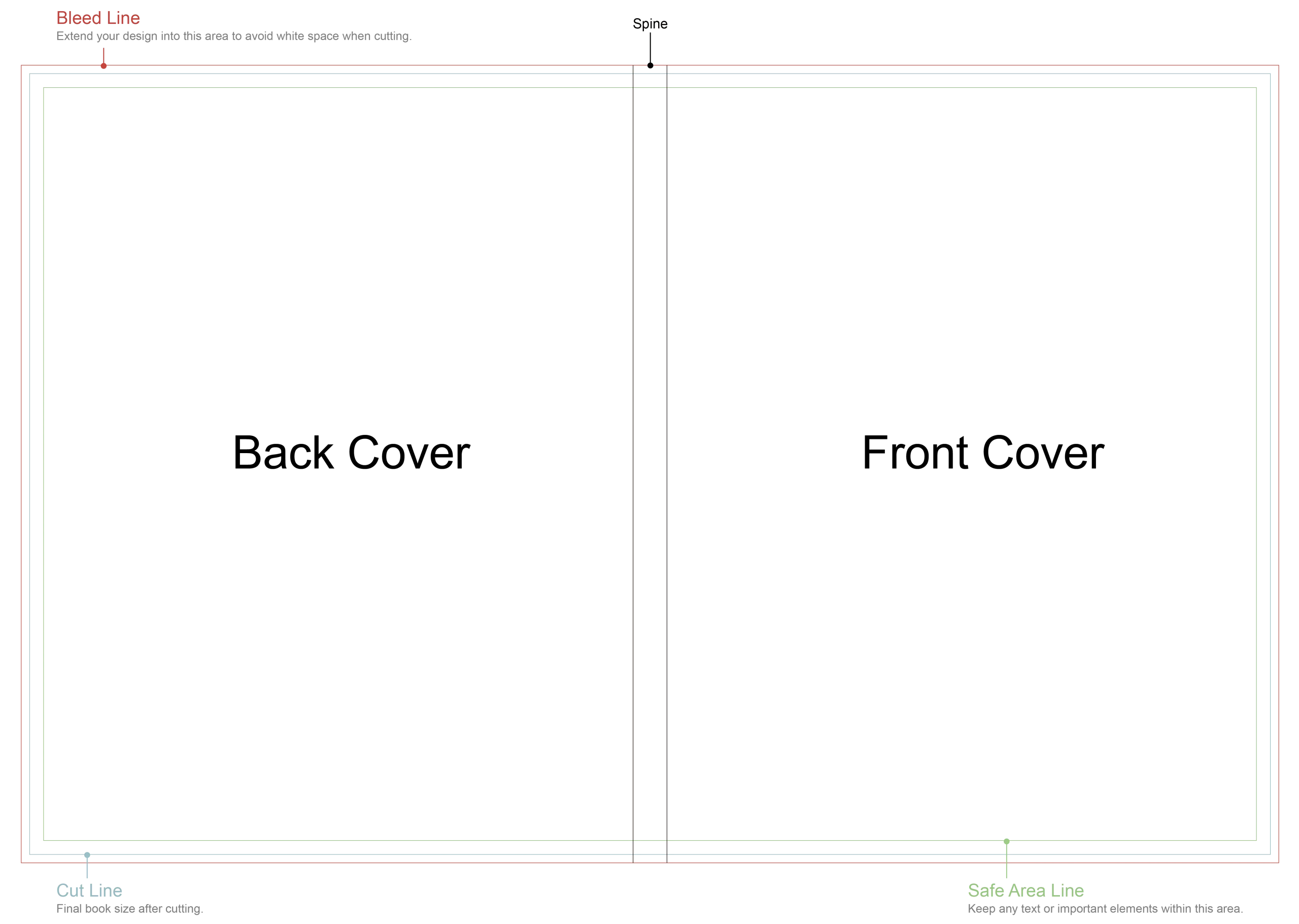
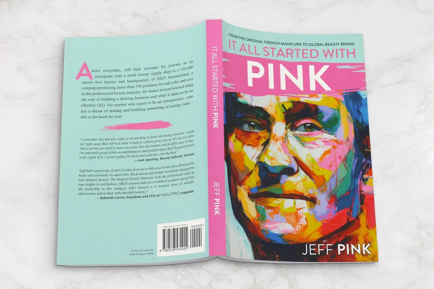
Full Cover
The full cover layout refers to the complete exterior design of the paperback book. It combines several components into one continuous file so that the printer can correctly align and wrap the cover around the interior pages during the binding process.
The full cover typically includes:
front cover
spine
back cover
bleed area
When submitting your design to the printer, these elements are usually provided in one single PDF file that follows the exact cover template dimensions supplied by the printing company. Using our cover template ensures that all elements are placed correctly and reduces the risk of misalignment during production.
Front Cover
The front cover is the most visually important part of your book. It is the first thing readers notice when browsing in bookstores, libraries, or online marketplaces. A well-designed front cover can immediately communicate the theme, tone, and genre of the book while capturing the reader’s attention.
An effective front cover should be visually appealing while remaining clear and easy to read. It should reflect the overall concept of the book and create curiosity that encourages potential readers to learn more.
Typical elements included on the front cover are:
Book title: the most prominent element, designed to be easily readable.
Subtitle: optional, used to provide additional context or explanation.
Author name: usually placed near the title or bottom of the cover.
Illustrations or images: artwork, photography, or graphic design that represents the content of the book.
Publisher logo: optional, often placed at the bottom of the cover.
When designing the front cover, it is important to maintain a balance between text and imagery. Too many elements can make the design look cluttered, while a clean layout helps improve readability and visual impact.
A strong front cover design plays a key role in helping your book stand out in a competitive marketplace.
Spine
The spine is the narrow section that connects the front and back covers. Although it is often overlooked, the spine is extremely important because it is the part most visible when books are placed vertically on shelves in bookstores or libraries.
A well-designed spine allows readers to quickly identify the book while browsing.
The spine typically includes:
book title
author name
publisher logo or imprint
These elements should be aligned carefully so they remain centered and readable after the book is bound.
However, the ability to include text on the spine depends on the thickness of the book. If the book has a low page count, the spine may be too narrow to display text clearly. In these cases, the spine may remain blank or include only minimal design elements.
Back Cover
The back cover provides additional information that helps readers decide whether to purchase the book. It serves both a marketing and informational purpose.
A well-designed back cover should present the content clearly while maintaining a visually balanced layout that complements the front cover design.
Common elements included on the back cover are:
Book description or summary: a short paragraph introducing the book and capturing reader interest.
Author biography: brief information about the author, sometimes accompanied by a photo.
Endorsements or reviews: quotes from critics, readers, or well-known authors that add credibility.
Publisher information: publishing house name, logo, or website.
Barcode: required for retail distribution and inventory tracking.
The layout of the back cover should leave enough space for the barcode and maintain good readability for the text.
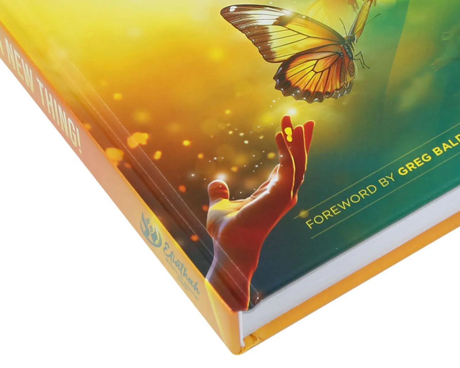
Bleed
Bleed refers to the extra area that extends beyond the trim edge of the book cover. This extra space ensures that background colors, patterns, or images extend fully to the edge of the printed cover after trimming.
During the printing process, paper sheets are trimmed to their final size. Slight variations can occur during cutting, so bleed prevents unwanted white borders from appearing at the edges of the cover.
Most printing companies recommend adding 3mm (approximately 0.125 inches) of bleed on all sides of the cover design.
For example, if your book’s final trim size is 6″ × 9″, the cover file should extend slightly beyond those dimensions to include the bleed area.
Without proper bleed settings, the final printed cover may show uneven edges or white lines, which can reduce the professional appearance of the book.
Safe Margin
The safe margin is the area inside the trim line where important design elements should remain. It acts as a protective buffer zone to ensure that text and critical images are not accidentally trimmed during production.
All essential elements such as titles, logos, and key graphics should be placed a safe distance away from the edges of the page.
Typical safe margin recommendations range from 5mm to 10mm inside the trim edge, depending on the printer’s specifications.
By keeping important elements within the safe margin, you can avoid common printing issues such as:
text being cut off
images appearing too close to the edge
uneven spacing after trimming
Maintaining proper bleed and safe margins helps ensure that the final printed book cover looks clean, balanced, and professionally produced.
How to Calculate the Spine Width of Paperback
The spine width is determined by the number of interior pages and the thickness of the paper used.
Accurate spine calculation is critical when designing the full cover layout.
Spine Width Formula
The general formula used in softcover book printing is:
Spine width = Cover paper thickness × 2 + Interior paper thickness × Inner Page Count ÷ 2
This formula accounts for both the cover material and the interior pages.
Factors Affecting Spine Width
Several factors influence the final spine width:
total number of pages
thickness of interior paper
cover paper thickness
For example, a book printed with thicker paper will have a wider spine compared to the same book printed on thinner paper.
Spine Wide Calculator
Note: For the above spine calculator, softcover books assume use a cover made of 250 gsm (92 lb) coated paper.
Steps to Design Your Paperback Cover File
Designing a paperback cover file correctly is essential to ensure your book prints accurately and looks professional after binding. A well-prepared cover file helps prevent common printing issues such as incorrect trimming, misaligned elements, or blurry images. Before starting the design process, it is recommended to obtain the cover template from your printing company, which will include the correct dimensions for the front cover, spine, back cover, and bleed areas.
Below are the key steps to follow when designing your paperback cover file for printing.
Formatting Your Cover Background
The first step in designing your cover is setting up the background layout correctly. Your background may include a solid color, gradient, pattern, or full-image design that spans the entire cover.
When preparing the cover background, it is essential to include 3mm bleed on all sides of the cover file. Bleed is the extra area that extends beyond the final trim size of the book. This ensures that background colors or images extend fully to the edge of the cover after trimming.
For example, if your final trim size is 6″ × 9″, the cover file should extend slightly beyond this size to include the bleed area. Any background color or image should extend into the bleed zone to avoid unwanted white edges after cutting.
Additionally, make sure to follow the safe margin guidelines provided in the template. Important elements such as titles, logos, and key graphics should not be placed too close to the trim edge to prevent them from being accidentally cut off during production.
Using professional design software such as Adobe InDesign, Illustrator, or Photoshop can help you manage bleed, trim lines, and safe margins more precisely.
Adding Images
Images play a crucial role in creating an attractive and professional-looking book cover. Whether you are using illustrations, photographs, or graphic designs, the image quality must meet printing standards.
To ensure the best print results, all images should be high resolution with a minimum of 300 DPI (dots per inch) at the final print size. Low-resolution images may appear blurry or pixelated when printed.
Here are a few important tips when adding images to your cover design:
Use high-quality original images whenever possible.
Avoid enlarging small images beyond their resolution limits.
Ensure images extend into the bleed area if they reach the edge of the cover.
Check that important visual details are placed within the safe margin.
It is also important to convert images to the CMYK color mode, which is the standard color model used for professional printing. RGB images may appear differently when converted during the printing process.
Adding Text
Text elements are an important part of the cover design because they communicate essential information about the book. The typography should be clear, readable, and visually balanced with the overall design.
Common text elements on a paperback cover include:
book title
subtitle
author name
tagline or promotional text
back cover description
author biography
When adding text to your cover file, keep the following design principles in mind:
Maintain safe margins: All text should remain within the safe margin area to prevent trimming issues.
Choose readable fonts: Select professional fonts that match the tone and genre of the book. Avoid overly decorative fonts that may reduce readability.
Use clear hierarchy: The book title should be the most prominent text element, followed by the subtitle and author name.
Align spine text carefully: If your book has a thick enough spine, ensure the title and author name are centered properly so they remain readable when the book is shelved.
Before sending your file to print, it is also recommended to embed all fonts or convert them to outlines to avoid font replacement issues.
Barcode Size and Placement
If your book will be sold through bookstores, online retailers, or distribution channels, it will require a barcode on the back cover. The barcode is used for inventory tracking and retail scanning.
The barcode is typically placed on the bottom right corner of the back cover, although exact placement may vary depending on the design.
Important guidelines for barcode placement include:
Leave a clear white background behind the barcode to ensure it can be scanned easily.
Do not place images, patterns, or text directly underneath the barcode.
Maintain a small blank area around the barcode known as the quiet zone.
The standard barcode size for books is approximately 1.5 inches × 1 inch, although the exact size may vary depending on the ISBN barcode format.
Your printer or publisher may provide specific barcode specifications or templates to ensure the barcode meets industry standards.
By following these steps when designing your paperback cover file, you can ensure that your book cover prints accurately and looks professional. Proper preparation of the cover file helps streamline the production process and ensures the final printed book meets high-quality publishing standards.
Pre-Publication Checklist
Before sending your cover design to print, it is essential to review your files carefully.
A pre-publication checklist helps prevent costly printing mistakes.
Embed Your Fonts
Embedding fonts ensures that your typography appears exactly as intended during printing.
If fonts are not embedded, they may be replaced by default fonts when the file is opened.
Remove Guidelines and Template Text
Design templates often include guides, notes, or placeholder text. These elements should be removed before exporting the final file.
Ensure Your Cover Image Is at Least 300 DPI
Low-resolution images can appear blurry or pixelated when printed. Always verify that your images meet the recommended 300 DPI resolution.
Save in CMYK Color PDF Format
Professional printing uses the CMYK color model rather than RGB. Saving your file as a CMYK PDF ensures accurate color reproduction during printing.
How to Choose the Paper for the Paperback Covers
Selecting the right paper for your paperback cover is an important decision because it directly affects the visual quality, durability, and overall feel of the finished book. The cover is the first thing readers see and touch, so choosing the appropriate paper and finish helps create a professional and attractive presentation.
For most softcover books, coated art paper is commonly recommended. Coated paper has a smooth surface that allows ink to sit evenly on the paper, producing sharper images, vibrant colors, and clearer text compared to uncoated paper.
There are two main types of coated paper used for paperback covers:
Glossy art paper features a shiny surface that enhances color saturation and image contrast. It is ideal for designs that rely heavily on bright colors, photographs, or detailed graphics.
Matte art paper has a non-reflective surface that creates a softer and more refined appearance. It reduces glare and is often preferred for books with a more elegant or minimalist design.
Both options provide excellent printing results, and the choice often depends on the style of the book and the desired visual effect.
Cover Paper Weight
The typical paper weight used for paperback covers ranges from 250gsm to 350gsm. The ideal paper weight will depend on several factors related to the book’s design and structure.
Key factors that influence cover paper weight include:
book trim size
total page count
design style and visual requirements
production budget
In general:
250gsm is considered the industry standard for paperback covers. It provides a good balance between flexibility, durability, and cost, making it suitable for most books.
300gsm offers a slightly thicker and sturdier feel, giving the book a more premium and durable appearance. This weight is often chosen for higher-quality publications.
350gsm is typically used for thicker books or high-end projects where additional cover strength is required.
For books with a higher page count, using a slightly thicker cover stock can help improve the overall structure and durability of the book.
Cover Lamination Options
Most paperback covers are finished with lamination after printing. Lamination adds a thin protective film to the surface of the cover, which helps protect it from scratches, moisture, and everyday wear while also enhancing the visual appearance.
Several lamination options are commonly used in softcover book printing.
Glossy Lamination
Glossy lamination creates a smooth, shiny surface that enhances color brightness and contrast. This finish makes images appear more vivid and eye-catching.
Glossy lamination is often used for:
children’s books
photo books
colorful or highly illustrated designs
Because of its vibrant appearance, glossy lamination works particularly well for books with strong visual elements.
Matte Lamination
Matte lamination provides a smooth, non-reflective finish that creates a more subtle and sophisticated look. It reduces glare and gives the cover a soft, modern appearance.
Matte lamination is commonly used for:
novels and literary books
corporate publications
minimalist or text-focused designs
Many publishers prefer matte lamination because it gives books a more refined and professional aesthetic.
Soft-Touch Lamination
Soft-touch lamination adds a velvety, luxurious texture to the surface of the cover. It feels smooth and slightly rubberized when touched, creating a premium tactile experience for readers.
This finish is often used for:
high-end book editions
premium brand publications
Soft-touch lamination not only improves the tactile quality of the book but also enhances its perceived value, making it a popular option for premium paperback printing projects.
Special Finishes for the Paperback Cover
Special finishing techniques can significantly enhance the visual appeal and tactile experience of a paperback book cover. These finishes are usually applied after the printing and lamination process to highlight specific design elements and create a more distinctive, premium appearance.
By combining different finishing effects, publishers and designers can make the book cover more eye-catching and memorable, helping it stand out on bookstore shelves or online listings.
Below are some of the most commonly used special finishes for paperback covers.
Foil Stamping
Foil stamping is a decorative finishing process that uses heat and pressure to apply metallic foil onto selected areas of the cover. The result is a shiny, reflective effect that adds elegance and sophistication to the design.
Popular foil colors include: gold, silver, red, blue, etc. Foil stamping is commonly used to highlight book titles, author names, logos, or decorative patterns, creating a luxurious and premium look for the cover.
Spot UV
Spot UV is a finishing technique that applies a clear, glossy coating to specific areas of the cover while leaving the surrounding surface matte. This contrast between glossy and matte textures helps draw attention to important design elements.
Spot UV is often used to highlight:
book titles
publisher logos
graphic patterns or illustrations
The glossy coating reflects light and adds subtle depth, making the highlighted areas visually stand out.
Emboss
Embossing is a technique that raises selected areas of the cover surface to create a three-dimensional effect. This process adds both visual depth and tactile interest to the design.
Embossing is often applied to:
titles
logos
decorative patterns
When readers run their fingers across the cover, the raised elements create a unique tactile experience that enhances the overall quality of the book.
Deboss
Debossing is the opposite of embossing. Instead of raising the design, it presses the design into the cover surface, creating an indented impression.
This technique produces a subtle and elegant effect that is often used for minimalist or sophisticated cover designs. Debossing works especially well when combined with foil stamping or textured cover materials.
Die Cut
Die cutting is a process that allows custom shapes or cut-out windows to be created in the book cover using a specialized cutting die. This technique can reveal images or colors from the inner pages or add unique design elements to the cover.
Die-cut covers are often used for:
creative book designs
children’s books
special edition publications
This finishing method helps create a distinctive and memorable visual presentation.
Holographic Effects
Holographic finishes produce rainbow-like reflective effects that shift and change depending on the viewing angle and lighting conditions.
This effect can be applied through laser foil stamping or holographic lamination. It is commonly used for designs that aim to be bold, vibrant, and highly eye-catching.
Holographic finishes are especially popular for:
children’s books
fantasy or creative designs
limited edition publications
By incorporating these special finishing options, designers can transform a standard paperback cover into a more visually striking and premium-quality product.
Where to Print Softcover Books?
Choosing the right printing partner is just as important as designing the cover itself.
BookPrintingChina has over 25 years of experience in custom book printing and binding, providing high-quality softcover book printing services for publishers, businesses, and independent authors around the world.
We specialize in producing a wide variety of softcover books, including:
novels
children’s books
photo books
textbooks
comic books
magazines
catalogs
Our printing services offer flexible options to match your project needs, such as trim sizes, paper selections, binding methods, and special finishes. Whether you are planning a small independent book project or a large commercial print run, our experienced team can help you produce high-quality paperback books with reliable turnaround times.
If you are ready to print softcover books, our experts can assist with cover design specifications, paper recommendations, and binding solutions to ensure the best results for your publication.