In book printing and typesetting, it usually involves the use of shading to decorate the layout.
So, how to correctly use shading to decorate the layout in book printing and typesetting?
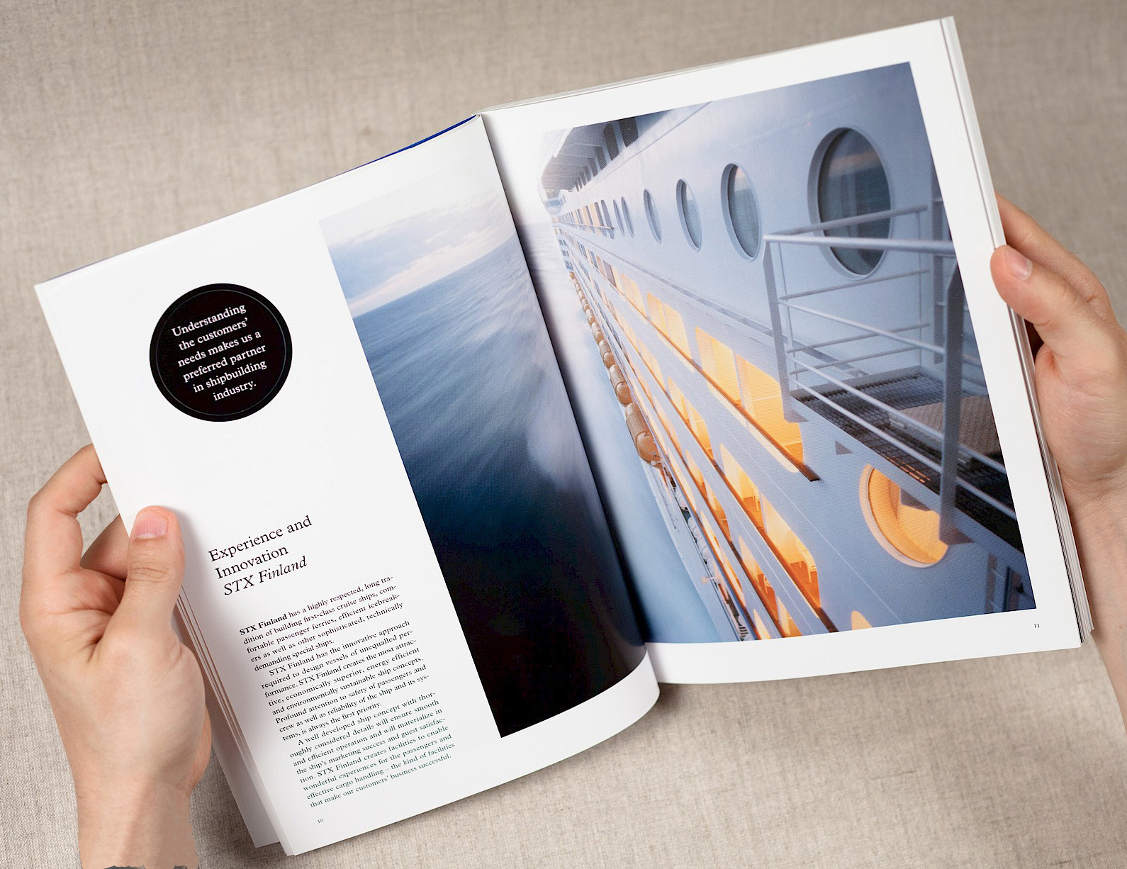
The following aspects should be paid attention to when using shading:
① Design different book printing layouts according to different layout content. For example, a news newspaper page emphasizes the clarity of the page text; an entertainment newspaper page can be modified with pictures and colors.
② The shading color selection should be reasonable. If the shading is yellow, it is recommended to use 100% pure yellow, otherwise, the light yellow has low visibility on newsprint, and it is difficult to have a higher printing quality; if there are black characters in the shading, it is recommended to use less shading Purple, cyan, green, red, etc., because these shading colors are less visible when matched with black characters, which affects the visual effect. If you really need to choose the shading of these colors, you can mark the black side with white side.
③ Set the picture on the newspaper with shading. In order to prevent the image from being affected by the shading, you can set the properties of the image to replace and then place it on the shading.
④ When using shading for layout modification in book printing and typesetting, do not set the shading too deep, so as not to affect the effect of the text.
⑤ When you encounter irregular shading in the typesetting of book printing, you can use the method of drawing irregular borders. When making irregular shading, you should first use some production tools to draw the outline of the irregular shading block, and then fill the required shading into the drawn irregular block.
⑥ The shading color is mostly used for sub-pure colors, pure colors, and less complex colors. Because complex colors are multi-color overprinting, it will inevitably increase the difficulty of color tracking in color newspaper printing, making it difficult to print colors and easy to color cast.
After that, you kown if you want to print a high quality and perfect book, you need to pay highly attention to know more knowledge about how to correctly use shading to decorate the layout. If you still have any questions, email us freely.
We are listed in designerlistings.org’s Print Design Directory


