
When it’s time to prepare your manuscript for print, proper formatting plays a key role in making your novel look professional, read comfortably, and meet publishing standards. A well-formatted book not only enhances readability but also improves printing efficiency and helps control production costs.
This comprehensive guide walks you through how to format your novel for printing, from selecting the ideal trim size and setting accurate margins to choosing the right fonts, spacing, and layout styles. Whether you plan to print your book through a custom book printing service or submit it to a traditional publisher, mastering these elements will help you achieve a truly professional result.
By applying these proven formatting techniques, you can turn your manuscript into a beautifully printed novel that captures your story’s tone and genre. From crisp typography to perfectly balanced margins, every design choice contributes to a final product that looks as exceptional as it reads.
Understand Your Novel’s Genre and Style
Novel formatting isn’t one-size-fits-all. Your book’s genre plays a crucial role in determining how it should look on the page, even before you start thinking about margins and fonts.
Why Genre Affects Formatting
A novel’s visual presentation helps readers quickly identify the type of story they’re getting. Each genre has developed its own visual language. Fantasy novels look different from romance or thriller titles on the page.
Each genre follows specific formatting conventions:
-
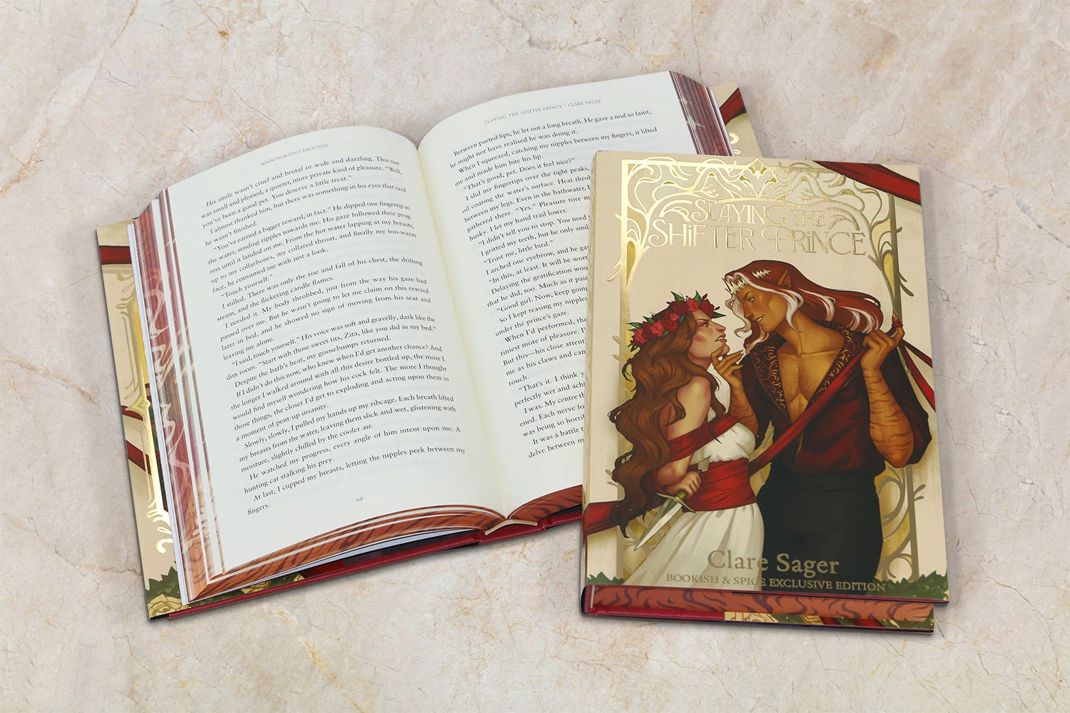
Fantasy and sci-fi novels showcase decorative chapter headings and might include maps or custom symbols for scene breaks
-
Literary fiction sticks to clean, minimal formatting with subtle typography
-
Romance novels use distinct chapter formatting and scene break indicators (like hearts or flourishes)
-
Thriller and mystery books use shorter paragraphs and chapters that create faster pacing
These genre expectations shape practical formatting decisions. Epic fantasy novels pack more words, so publishers use smaller font sizes and tighter line spacing to keep page counts and printing costs manageable. Middle-grade fiction takes the opposite approach with larger fonts and more generous spacing that young readers can follow easily.
Trim size choices depend on genre, too. Romance paperbacks come in smaller trim sizes (around 4.25″ x 7″), while contemporary literary fiction appears in larger formats (5.5″ x 8.5″ or 6″ x 9″). These conventions matter a lot when you prepare your novel for printing.
How to Research Formatting Styles in Your Niche
The quickest way to start your research is to look at physical books in your genre. Get 5-10 recently published titles that match your manuscript and study:
-
Trim size and overall dimensions
-
Margin width and gutter spacing
-
Font choices and sizes
-
Chapter opening layouts
-
Scene break indicators
-
Header/footer styles
A notebook in hand at bookstores helps you measure various aspects of books in your genre. This hands-on approach gives you a great way to learn current formatting trends.
Online resources can guide you, too. Publishing platforms offer genre-specific templates that match industry standards for novel book printing. These templates give you a solid foundation to format your novel for printing.
Professional associations in your genre might publish style guides or formatting recommendations. Genre-specific writing forums have discussions about formatting priorities from both readers and authors.
Award-winning books or bestsellers in your genre deserve extra attention. They show what professional formatting looks like at its best. Some custom novel printing services share genre-specific formatting guides, too.
Your book should follow genre conventions but still feel unique. The sweet spot lies in meeting reader expectations while adding subtle touches that make your story’s presentation special.
Prepare Your Manuscript for Formatting
A clean manuscript is your first step before print formatting. Just like a house needs solid foundations, your novel needs clean, consistent text to build upon.
Clean up Your Text and Remove Extra Spaces
Your manuscript picks up formatting quirks during writing. So before you format your novel to print, strip the text down to basics. At this stage, keep only italics and boldfacing that you need for emphasis.
Here’s how to start the cleanup:
-
Save your manuscript under a new filename (add “clean” to distinguish it from your draft)
-
Turn on “show paragraph marks” in your word processor to see hidden formatting
-
Use Find and Replace to fix common formatting issues:
-
Replace double spaces with single spaces (repeat until none remain)
-
Replace double paragraph breaks with single breaks
-
Remove tabs or spaces used for paragraph indents
-
Your body paragraphs should look consistent throughout the manuscript. Expert editors say unclean manuscripts look “as if they’ve been fed through a wood chipper” once you get into the formatting.
Authors often make basic formatting mistakes. They use underlines instead of italics or add double spaces after periods. These old habits create problems during the book printing process.
Take time to remove these unnecessary elements before formatting:
-
Extra line breaks between paragraphs
-
Manual tabs for indents
-
Colored text or fancy fonts
-
Images or decorative scene breaks (you’ll add these later)
Use Styles for Headings and Chapters
A clean manuscript lets you set up proper styles next. Styles are the foundations of consistent formatting throughout your document.
Start by modifying the “Normal” style for body text:
-
Right-click on the “Normal” style in your word processor’s Styles pane
-
Select “Modify” and choose your font (Times New Roman is standard)
-
Set paragraph indentation (0.2″ or 5mm works well for first-line indent)
-
Establish proper line spacing (single or double, based on your needs)
-
Remove any extra spacing before or after paragraphs
Your chapter headings need proper styling too. Instead of formatting each title manually:
-
Place your cursor at the first chapter title
-
Apply “Heading 1” style from the Styles pane
-
Modify the style to match your desired formatting (centered, larger font, etc.)
-
Apply this style to all chapter titles for consistency
This method gives you great benefits for custom novel printing. All similar elements look the same throughout your book. You can also make quick global changes, modify a style once, and it updates everywhere in your manuscript.
Note that page breaks work better than multiple returns to start chapters on new pages. This helps avoid formatting issues if you edit your text later.
Choose the Right Trim Size and Margins
The trim size and margins you choose will make or break your novel’s print format. These physical dimensions will affect your book’s shelf appeal, production cost,s and reading experience.
Common Trim Sizes for Novels
Your printed novel’s dimensions play a key role in its professional look. Publishers call these final measurements “trim size“, the actual dimensions after manufacturing cuts and trims the pages.
Most novels use these trim sizes:
-
5″ x 8″ – Popular for thrillers, mysteries, and shorter works
-
5.25″ x 8″ – Commonly used for memoirs and shorter novels
-
5.5″ x 8.5″ – Often called “digest size,” ideal for most fiction
-
6″ x 9″ – The most common trim size in the US, especially for longer novels
Your genre should guide this choice. Thrillers and mysteries work best at 5.25″ x 8″, while general fiction tends to use 6″ x 9″ formats. Young adult fiction looks best in 5″ x 7″ or 5.5″ x 8.5″ formats.
Mass-market paperbacks (4.25″ x 6.87″) are familiar to readers but rarely work for self-publishing. These pocket-sized books need specialized retail channels for distribution.
Setting Margins and Gutter Space for Print
Good margins keep your text visible and prevent production cutoffs. They create white space that makes your novel appealing and easy to read.
The “gutter” is the inner margin where pages meet at the binding. This margin needs more space than others because your book curves inward here.
Your book’s thickness determines the right margin size. Thicker books need wider gutters as pages curve deeper into the binding. Page count helps you pick the best gutter width:
-
24-150 pages: 0.375″ gutter
-
151-300 pages: 0.5″ gutter
-
301-500 pages: 0.625″ gutter
-
501-700 pages: 0.75″ gutter
-
701-828 pages: 0.875″ gutter
Top, bottom, and outside margins need at least 0.25″ for books without bleed and 0.375″ for books with bleed. Professional designers suggest larger margins (0.5″ to 1″) to improve readability.
Word processors offer a “mirror margins” option that handles different gutter positions on left and right pages. This creates a professional, symmetrical look when readers see facing pages.
Note that wrong margin settings often cause problems in self-published books. Take time to verify these specifications before you submit files to print your novel.
Select Fonts, Spacing, and Alignment
Typography choices shape how readers experience your novel. The right font selection, spacing, and text that lines up create pages that look good and stay comfortable for long reading sessions.
Best Fonts for Readability
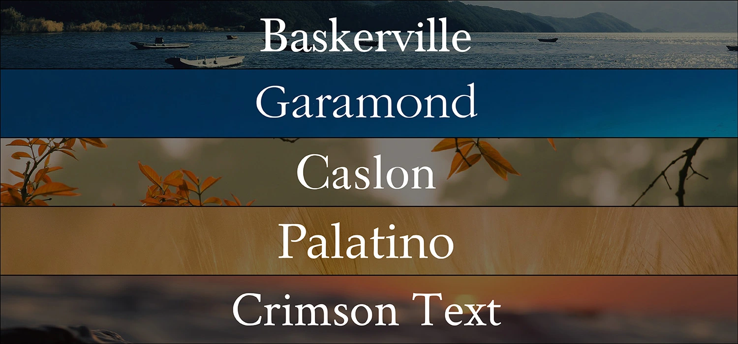
Serif fonts stand out as the top choice for body text in printed novels. These fonts have small decorative strokes (serifs) that help readers’ eyes flow from one character to the next. Here are some popular serif fonts that work great in printed books:
-
Baskerville: A classic font with excellent readability
-
Garamond: A 16th-century font that stays popular for its elegant readability
-
Caslon: A warm, inviting feel with historical significance
-
Palatino: First made for headings, but works well in book text
-
Crimson Text: A modern font made just for book printing
These serif fonts help bind text together, so readers can breeze through long passages. Sans-serif fonts like Helvetica or Arial work best only in headings or other specific spots in printed books.
Font Size and Line Spacing Guidelines
Adult and young adult novels typically use font sizes between 10 and 12 points. Your font size choice can really change your book’s length. A 200-page manuscript in 10-point font might grow to 250 pages in 12-point. This gives you a chance to match what readers expect in your genre. If readers want longer books, slightly bigger fonts can help meet those expectations.
Line spacing (leading) needs just as much attention. Fiction books usually need 1.15 to 1.25 line spacing. Some experts suggest 1.5 for the best reading experience. The sweet spot lies in the middle – too close feels tight, too far feels scattered. Most books use leading that’s 1.2 to 1.5 times the font size.
Eye-tracking studies back up these numbers. Research shows reading gets easier up to an 18-point font size. Smaller fonts take longer to read and make it harder to understand the text.
Justification and Paragraph Indentation
Printed books mostly use fully justified text to create clean, even edges on both sides. This gives your novel a polished look. E-books work better with left-aligned text.
Here’s what you should know about paragraph indentation:
The tab key isn’t your friend for indents. Set your first-line indents to about 0.5 inches in your word processor’s paragraph settings. This keeps your indents the same throughout the book.
Not every paragraph needs an indent. New chapters or paragraphs after scene breaks should start flush left. All other paragraphs should keep the same indent.
The space between paragraphs matches the space between lines in traditional book design. Skip extra paragraph spacing – that’s more for websites than books.
A well-laid-out novel respects both your readers’ comfort and industry standards. Getting these typography elements right helps create a professional book that readers will enjoy.
Structure Your Chapters and Scene Breaks
Well-laid-out chapters and scene breaks create a reading rhythm that keeps your audience involved throughout your novel. The formatting of my novel needs careful thought about how these elements work together to improve the reader’s experience.
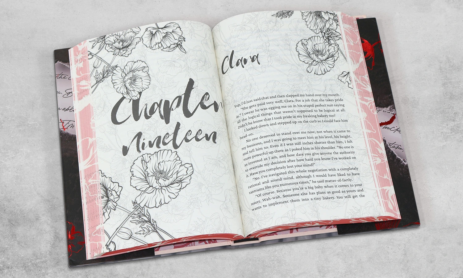
Formatting Chapter Titles and Openings
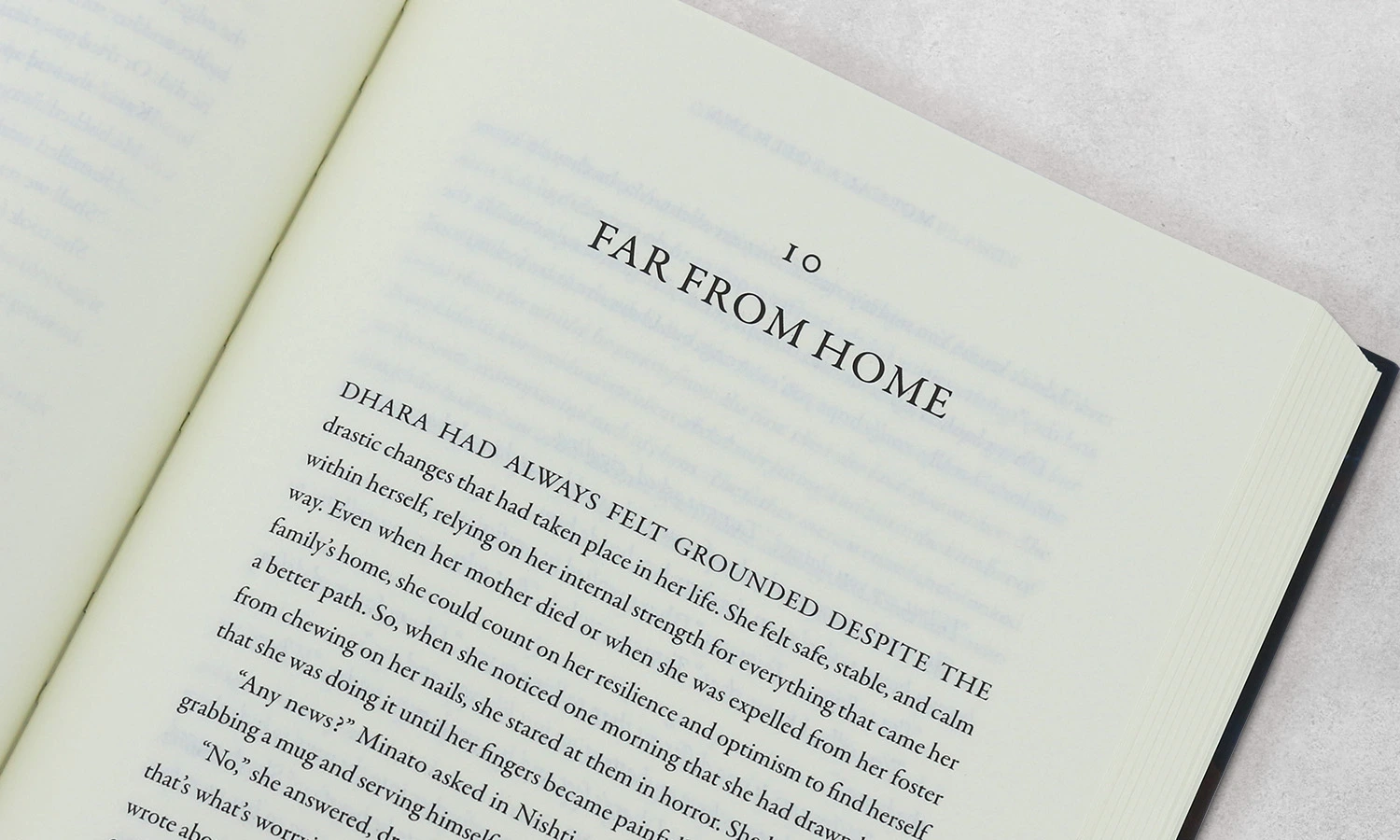
Your novel’s chapter openings just need special care during print preparation. Each chapter’s first page should begin one-third down the page, about fourteen single-spaced lines from the top. This spacing creates visual breathing room that signals new content.
Center chapter titles on the first line of this starting position, not right above where the text begins. This approach is different from short story formatting, where titles usually appear right above the text. The chapter titles should match your body text font, just larger, 18 points works well. Skip bold or underline formatting for chapter titles since the larger size stands out enough.
Leave the first paragraphs after chapter titles unindented. A clean, professional look sets chapter openings apart from regular paragraphs. Any epigraph (a quote at the chapter beginning) belongs between the chapter title and the text.
Using Scene Breaks Effectively
Scene breaks in chapters show changes in location, time, narrator, or other important changes. These breaks help readers direct through transition smoothly. Print formatting offers several ways to show these breaks:
-
A blank line (extra spacing between paragraphs)
-
Three centered asterisks (* )
-
A small ornamental symbol centered on its own line
-
A simple line or decorative element
Your book needs one consistent style throughout. Don’t mix styles by using asterisks in one chapter and blank lines in another.
Paragraphs after scene breaks should stay unindented, like chapter openings. Scene breaks at the top or bottom of printed pages might become invisible. Publishers often add three small centered bullets or symbols to clarify these breaks in the final printed novel.
When to Start New Chapters on a New Page
Printed novels need each chapter to start on a new page, and add a page break at the end of the previous chapter. This rule changes based on your work’s structure and length:
Shorter works, like articles or lecture notes, might only use sections instead of chapters. Longer works like novels must have chapters starting on new pages. The longest works with multiple parts may have separate part pages with chapters beginning on new pages.
Chapter break placement combines technical and artistic choices. Thriller or mystery chapters ending at high tension points keep readers turning pages. Location changes, time shifts, or point of view switches often make natural chapter breaks.
Chapter structure affects pacing in your print-ready novel. Short chapters speed up the pace while longer ones build deeper character connections.
Add Front Matter and Back Matter
Your manuscript’s front and back matter deserve the same attention as your main story. These sections are the foundations of a professional book presentation and guide readers through your work.
What to Include in the Front Matter
The front matter comes before your main content and has several key elements in a specific order:
-
Half-title page: Your book title stands alone on a right-facing page without page numbers
-
Title page: A right-facing page after the half-title shows your book title, subtitle, and author name without “by” before the name
-
Copyright page: The first left-facing page after the title page has your copyright notice, publication details, and ISBN
-
Dedication page: A right-facing page that usually follows the copyright page
-
Table of contents: The right-facing page lists all chapters and sections as they appear in your manuscript
Your front matter builds credibility and helps readers navigate your novel’s structure. You might want to add a foreword (written by someone else) or preface (your thoughts on writing the book) based on your novel’s requirements.
Everything in the Back Matter
The back matter follows your final chapter and lets readers dive deeper. Fiction writers should include an author bio on a right-facing page and acknowledgments to thank their supporters. You might add an epilogue to wrap up loose ends or preview your next book to keep readers engaged.
Nonfiction books can have a bibliography of sources, an appendix with extra information, or a glossary of specialized terms. An index helps readers find specific topics throughout your book.
Page Numbering and Headers
Different sections need different page numbers. Pages before the table of contents stay unnumbered. The section between the table of contents and chapter one uses lowercase Roman numerals (i, ii, iii). The main text and back matter use Arabic numerals (1, 2, 3), starting with “1” on your first chapter page.
Note that chapter opening pages should not have headers. Other pages should have the book title in the left (verso) header and the chapter title in the right (recto) header. Page numbers belong in the outer margins of running headers.
The formatting process needs proper page breaks between sections. Headers between front matter and main content should be unlinked to maintain consistent formatting throughout your book.
Use Tools to Format and Export Your Novel
Your choice of software will affect how well you can format your novel for printing. Let’s get into which tools might work best for your needs.
Overview of Formatting Tools
Microsoft Word’s accessibility makes it appealing, but it lacks specialized book formatting features. Creating professional results takes extra effort, though many authors start with it because they’re familiar with the platform.
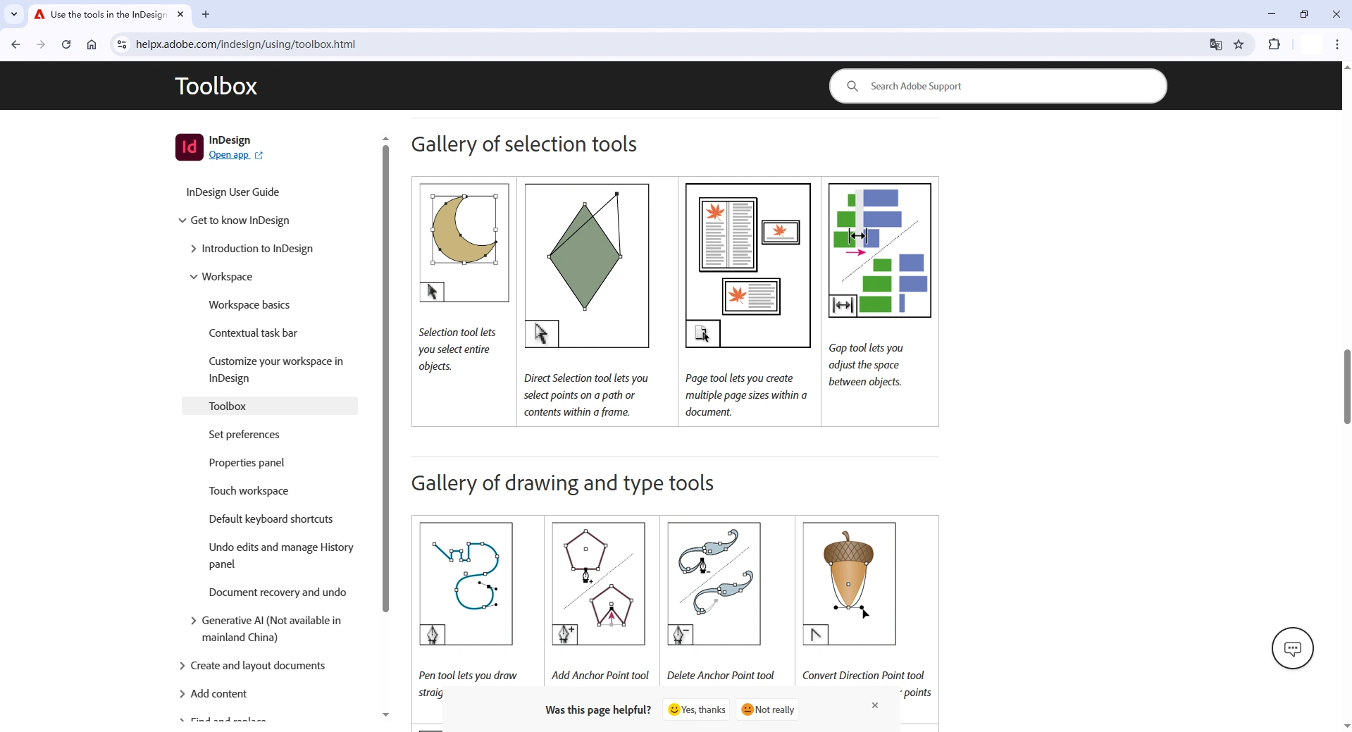
Adobe InDesign is the professional standard for book formatting. This powerful tool creates high-quality layouts for print and gives complete control over every element.
Scrivener shines as a writing tool but doesn’t quite deliver on formatting. While it has simple compiling features for different formats, we used it mainly to draft and organize manuscripts, not to create print-ready files.
How to Export to PDF for Custom Novel Printing
PDF exports need “high quality print” settings to keep the resolution intact. Font embedding is crucial to avoid substitution problems. Book printing works best with PDF/X-1a format, which will give a smooth experience with most printing services.
Avoiding Common Formatting Mistakes
These warning signs immediately show amateur work:
-
Ragged right justification (use full justification instead)
-
Headers appearing on chapter opening pages
-
Excessive hyphenation between lines
-
Inconsistent paragraph spacing and indentation
Conclusion
Formatting your novel for print may seem like a technical challenge, but it’s truly the bridge between your creative vision and the finished book in your readers’ hands. The details, such as trim size, margins, fonts, spacing, and layout, work together to create a professional reading experience that reflects the quality of your writing.
Each genre has its own style conventions, and aligning your book with those expectations helps readers connect instantly with your story. A clean manuscript and precise formatting reduce printing errors and enhance your book’s overall appeal.
Once you’ve set up your chapters, scene breaks, and page layouts, finalize your file as a print-ready PDF with fonts embedded and high-resolution settings. From there, you’re ready to bring your story to life in print.
At BookPrintingChina, we’ve been helping authors and publishers bring their books to life for over 25 years. Whether you’re printing fiction or nonfiction, we provide high-quality book printing services at competitive prices, along with free file checking, proofing support, artwork guidance, and door-to-door global shipping.
Let your story take its final step from manuscript to masterpiece with professional printing you can trust. Contact us to start your custom novel printing journey today.