

In this comprehensive guide, we’ll explore how to design a hardcover book, providing you with invaluable insights to bring your literary vision to life.
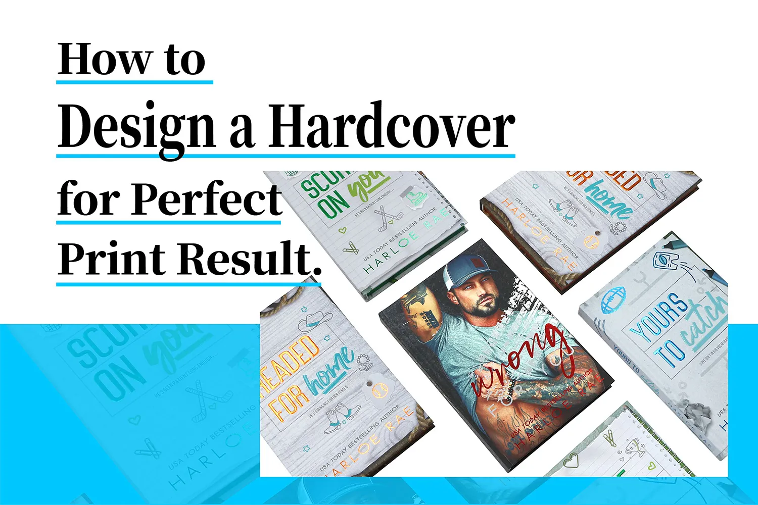
The journey of designing a hardcover book is both challenging and rewarding. It requires a delicate balance of creativity, technical knowledge, and an understanding of industry standards. Whether you’re an aspiring author, a seasoned designer, or a publishing professional, mastering the art of hardcover design can elevate your work and leave a lasting impression on readers.
In this article, we’ll explore the key aspects of hardcover book design, from cover creation to interior layout. We’ll delve into the importance of choosing the right trim size, selecting appropriate fonts, and incorporating essential design elements. Additionally, we’ll discuss the benefits of working with professional designers and provide valuable tips for ensuring your hardcover book stands out in a competitive market.
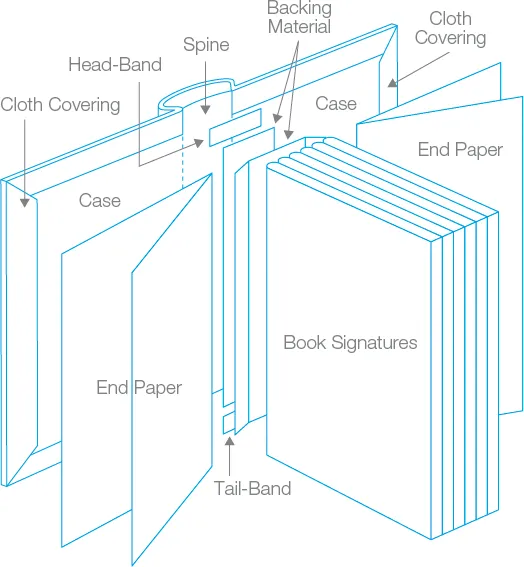
Understanding the Anatomy of a Hardcover Book
Before diving into the design process, it’s crucial to understand the components that make up a hardcover book. A typical hardcover consists of several key elements:
-
Case: The rigid outer cover, usually made of cardboard covered with cloth, paper, or leather.
-
Spine: The vertical edge that connects the front and back covers.
-
Endpapers: The decorative pages that connect the book block to the case.
-
Book block: The interior pages of the book, bound together.
-
Headband and footband: Decorative fabric strips at the top and bottom of the spine.
-
Dust jacket: A removable paper cover that protects the book and provides additional design space.
Understanding these components allows us to approach the design process holistically, ensuring that each element complements the others to create a cohesive and visually appealing product.
The Importance of Professional Hardcover Book Design
In today’s competitive publishing landscape, the significance of professional hardcover book design cannot be overstated. A well-designed book not only captures the essence of its content but also serves as a powerful marketing tool. Here’s why investing in professional design is crucial:
-
First impressions matter: Your book’s cover is often the first point of contact with potential readers. A professionally designed cover can pique interest and entice readers to pick up your book.
-
Brand consistency: A cohesive design across your book’s cover, spine, and interior pages reinforces your brand and creates a memorable reading experience.
-
Perceived value: High-quality design elevates the perceived value of your book, potentially justifying a higher price point and increasing sales.
-
Longevity: Hardcover books are built to last, and a timeless design ensures your book remains relevant and appealing for years to come.
Key Elements of Compelling Hardcover Book Cover Design
The cover of your hardcover book is arguably its most important design element. It’s the face of your work, and it needs to make a strong impression. When designing a compelling cover, consider the following key elements:
-
Typography: Choose fonts that reflect the tone and genre of your book. Experiment with different sizes, weights, and arrangements to create visual interest.
-
Imagery: Select or create visuals that capture the essence of your story or subject matter. This could include photographs, illustrations, or abstract designs.
-
Color palette: Develop a color scheme that evokes the right emotions and aligns with your book’s themes.
-
Composition: Arrange elements in a way that guides the viewer’s eye and creates a sense of balance or intentional imbalance.
-
Negative space: Don’t be afraid to use white space strategically to create a clean, sophisticated look.
Remember, the goal is to create a cover that not only looks beautiful but also effectively communicates the core message of your book at a glance.
Key Cover File Elements of a Hardcover
Creating a visually appealing and structurally sound hardcover book involves careful consideration of several key design elements. Each component plays a crucial role in the overall aesthetics and functionality of the finished product. Let’s explore these essential elements in detail:
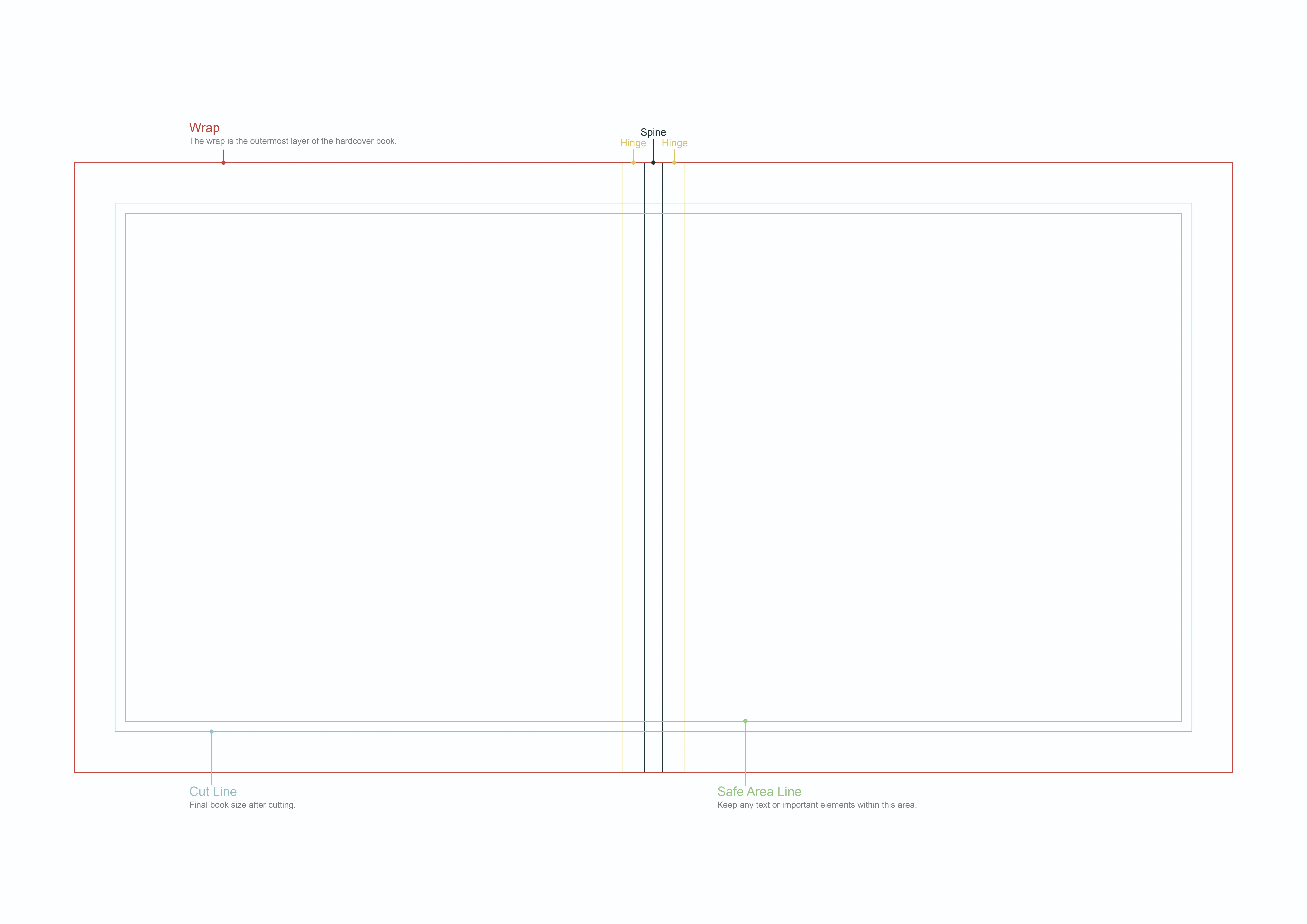
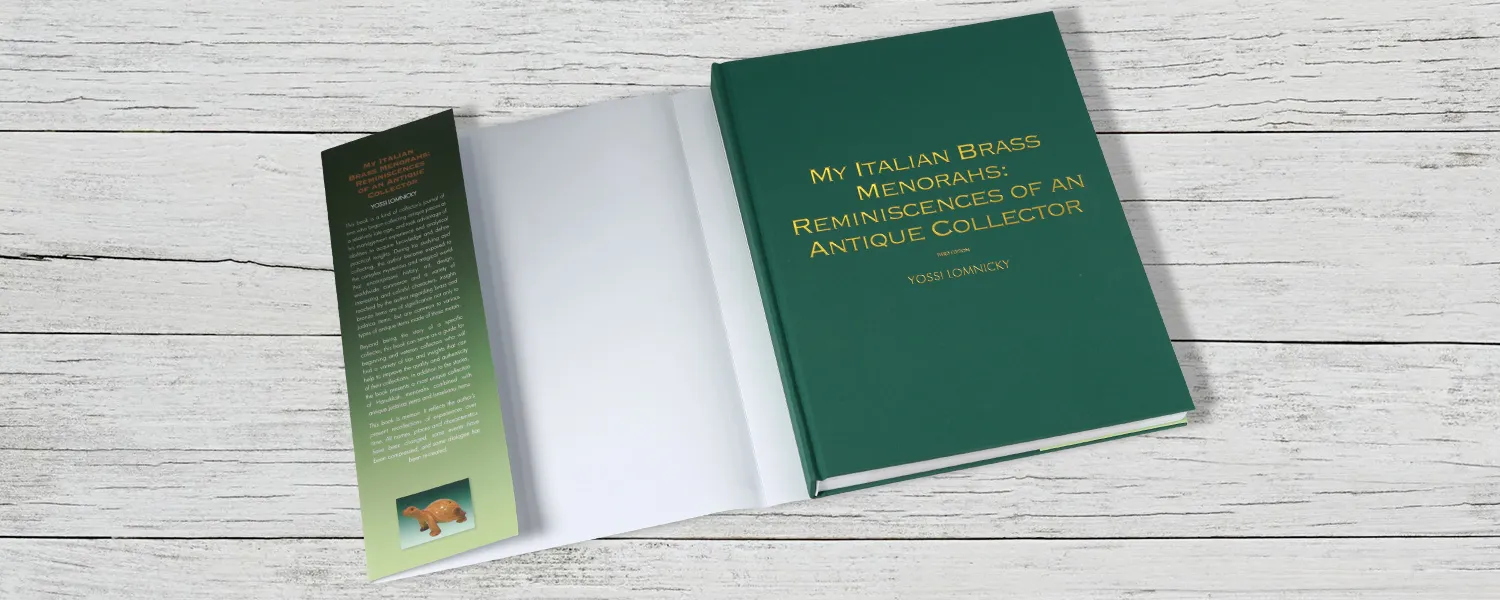
Wrap
The wrap is the outermost layer of the hardcover book, typically made of cloth, leather, or paper. It serves both aesthetic and protective purposes, shielding the book’s contents while providing a canvas for the cover design. When designing the wrap, consider the following:
-
Material selection: Choose a material that complements the book’s theme and target audience. Textured fabrics can add a tactile element, while smooth surfaces may be better suited for intricate designs.
-
Color palette: Select colors that align with the book’s genre and mood. Bold, vibrant colors can make a statement, while muted tones may convey sophistication.
-
Durability: Opt for materials that can withstand frequent handling and environmental factors to ensure the book’s longevity.
Trim Area
The trim area refers to the final size of the book after it has been cut to its intended dimensions. This area is crucial for ensuring that all design elements are properly positioned and visible in the finished product. Use guidelines or templates provided by your printer to accurately identify the trim lines.
Safe Area
The safe area is the inner portion of the cover design where all critical elements, such as text and logos, should be placed. This area ensures that important information remains visible and unaffected by potential trimming variations. When working with the safe area:
-
Keep essential text and graphics within this zone to avoid accidental cropping.
-
Use guidelines or templates provided by your printer to accurately identify the safe area boundaries.
-
Consider the visual balance of elements within this space to create an appealing composition.
Hinge
The hinge, or crease, is the flexible area between the cover and the spine that allows the book to open smoothly. Proper design consideration for the hinge is essential for both functionality and aesthetics:
-
Allow sufficient space for the hinge to prevent design elements from being distorted when the book is opened.
-
Consider how the cover design will interact with the hinge area, ensuring a seamless transition from cover to spine.
-
Be mindful of text placement near the hinge to maintain readability when the book is opened.
Spine
The spine is the vertical edge of the book that connects the front and back covers. It plays a crucial role in the overall design and is often the first part of the book visible on a bookshelf. When designing the spine:
-
Include the book title and author name for easy identification.
-
Consider the spine width, which varies based on the number of pages and paper thickness.
-
Ensure that spine text is oriented correctly for both left-to-right and right-to-left reading cultures.
-
Create a design that complements the front and back covers while standing out on its own.
Choosing the Right Materials for Your Hardcover Book
The tactile experience of a hardcover book is an integral part of its appeal. Selecting the right materials can enhance this experience and contribute to the overall design aesthetic. Consider the following options:
-
Cover material: Choose from options like cloth, leather, or paper wrap around 2-3mm gray board. Each material offers a unique look and feel.
-
Paper stock: Select a paper weight and finish that complements your content. Coated papers work well for image-heavy books, while uncoated papers are ideal for text-heavy works.
-
Special finishes: Consider options like spot UV coating or soft-touch lamination to add visual interest and protect your cover, or foil stamping, emboss to add a luxury look.
Opt for a Proper Trim Size
Selecting the appropriate trim size for your hardcover book is a crucial decision that impacts not only the book’s aesthetics but also its functionality and production costs. The trim size refers to the final dimensions of the book after it has been cut to size. Choosing the right trim size requires careful consideration of several factors:
Industry Standards
While there’s no one-size-fits-all approach to trim sizes, certain dimensions have become standard in the publishing industry. Common hardcover trim sizes include:
-
6″ x 9″: A versatile size suitable for most fiction and non-fiction books.
-
5.5″ x 8.5″: Often used for memoirs, novellas, and shorter works.
-
7″ x 10″: Popular for textbooks, cookbooks, and art books.
-
8.5″ x 11″: Typically used for large-format books, children’s picture books, and coffee table books.
Genre Considerations
Different genres often have specific trim size expectations:
-
Fiction: Most adult fiction books fall within the 5.5″ x 8.5″ to 6″ x 9″ range.
-
Non-fiction: Depending on the subject matter, sizes can vary from 5.5″ x 8.5″ for memoirs to 7″ x 10″ for instructional books.
-
Children’s Books: Picture books often use larger formats like 8″ x 10″ or 8.5″ x 11″ to accommodate illustrations.
-
Academic and Professional Books: These typically range from 6″ x 9″ to 7″ x 10″ for easy readability and note-taking.
Content and Layout
The nature of your content should influence your trim size choice:
-
Text-heavy books may benefit from a smaller trim size for comfortable reading.
-
Books with numerous illustrations or photographs might require a larger format to showcase visual elements effectively.
-
Consider the length of your book – a very thick book in a small trim size may be unwieldy, while a thin book in a large format might seem insubstantial.
Production Considerations
Trim size affects various aspects of book production:
-
Printing costs can vary based on trim size, with standard sizes often being more economical.
-
Paper waste should be minimized by choosing a trim size that aligns well with standard paper sheet sizes.
-
Shipping and storage costs may increase with larger trim sizes.
Reader Experience
Think about how readers will interact with your book:
-
Will it be read primarily at home or on-the-go?
-
Does the content require note-taking or margin annotations?
-
Is the book likely to be displayed on a bookshelf or coffee table?
Design Impact
The trim size influences your cover and interior design:
-
Larger trim sizes offer more space for creative cover designs and interior layouts.
-
Smaller sizes may require more concise cover elements and tighter interior margins.
Testing and Mockups
Before finalizing your trim size:
-
Create physical mockups to get a tangible sense of how the book will feel in hand.
-
Test different layouts within your chosen trim size to ensure optimal readability and visual appeal.
-
Consider seeking feedback from potential readers or industry professionals.
Remember that while standard sizes are often more cost-effective, don’t be afraid to explore unique dimensions if they truly serve your book’s purpose and target audience. The right trim size can significantly contribute to the overall success and impact of your hardcover book.
Color Theory and Typography in Hardcover Design
Color and typography are powerful tools in hardcover book design, capable of evoking emotions and setting the tone for your work. When approaching these elements, consider the following:

Color Theory:
-
Psychological impact: Different colors evoke different emotions. For example, blue can convey trust and stability, while red might suggest passion or urgency.
-
Genre conventions: Certain colors are often associated with specific genres. Be aware of these conventions, but don’t be afraid to subvert them creatively.
-
Contrast: Use contrasting colors to make important elements stand out and improve readability.
-
Color harmony: Create a cohesive look by using complementary, analogous, or monochromatic color schemes.
Typography:
-
Font selection: Choose fonts that reflect the tone of your book and are appropriate for your genre.
-
Hierarchy: Use different font sizes, weights, and styles to create a clear hierarchy of information.
-
Readability: Ensure that your chosen fonts are legible at various sizes, especially for the spine and back cover text.
-
Kerning and leading: Pay attention to letter spacing and line height to improve overall readability and aesthetics.
Creating a Cohesive Spine and Back Cover Design
While the front cover often gets the most attention, the spine and back cover play crucial roles in the overall design of your hardcover book. Here’s how to approach these elements:
Spine Design:
-
Readability: Ensure that the title and author name are easily readable when the book is shelved.
-
Consistency: Use design elements that complement the front cover while maintaining a unique identity.
-
Special touches: Consider adding decorative elements or using foil stamping to make the spine stand out.

Back Cover Design:
-
Book summary: Craft a compelling synopsis that entices readers to open the book.
-
Author bio: Include a brief author biography and photo if appropriate.
-
Testimonials: Feature positive reviews or endorsements from reputable sources.
-
ISBN and barcode: Place these essential elements in a way that doesn’t detract from the overall design.
Incorporating Dust Jackets into Your Hardcover Design
Dust jackets offer an additional canvas for creativity in hardcover book design. Here’s how to make the most of this versatile element:
-
Extended artwork: Use the dust jacket to showcase expanded versions of your cover art or additional imagery.
-
Author information: Include a more detailed author bio and photo on the inside flaps.
-
Marketing opportunities: Use the back flap for information about other books in a series or upcoming works.
-
Protection: Design with durability in mind, as dust jackets serve to protect the book’s cover.
-
Removable design: Consider how the book will look both with and without the dust jacket, ensuring that the underlying cover is also visually appealing.

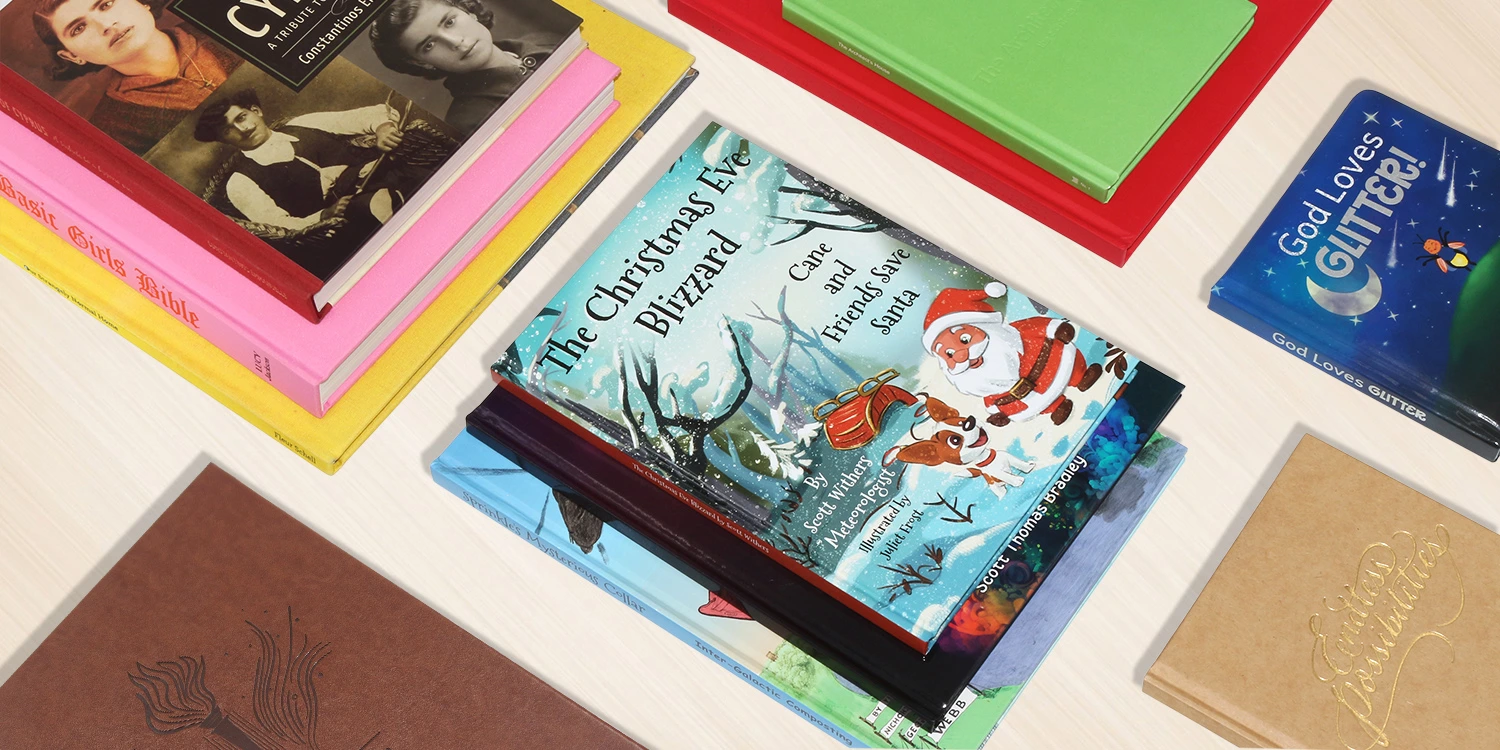
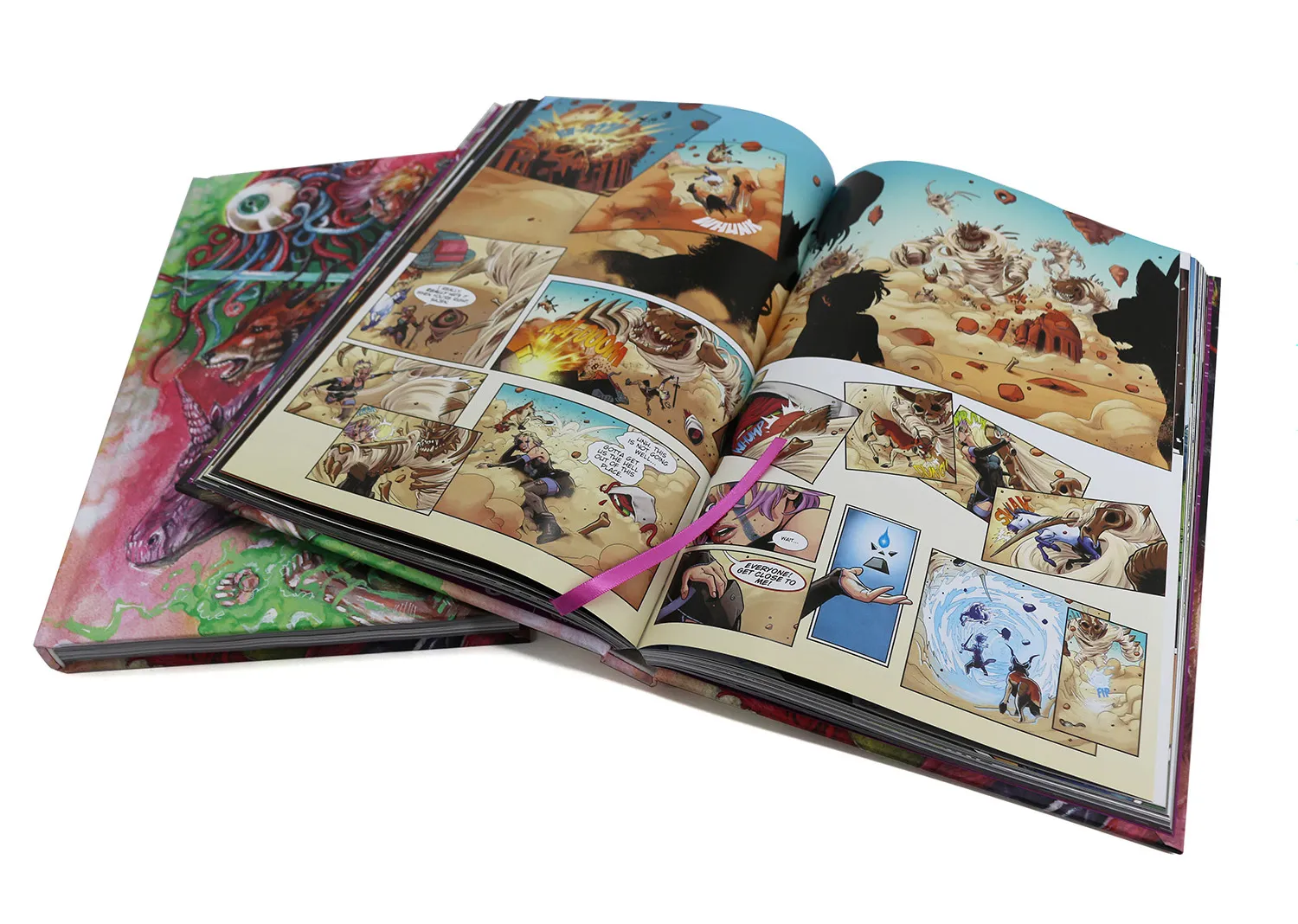
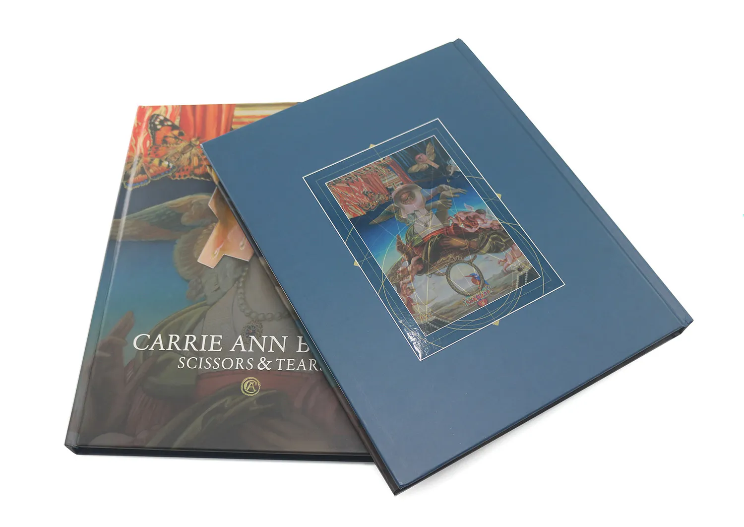
The Role of Illustrations and Images in Hardcover Books
Illustrations and images can significantly enhance the visual appeal and storytelling power of a hardcover book. Here’s how to effectively incorporate these elements:
-
Consistency: Ensure that the style of illustrations or images aligns with the overall tone and genre of the book.
-
Quality: Use high-resolution images and professional illustrations to maintain a polished look.
-
Placement: Strategically position images to complement the text and enhance the reader’s understanding.
-
Color coordination: Coordinate the color palette of illustrations with the overall book design for a cohesive look.
-
Balance: Strike a balance between text and visual elements to create an engaging layout without overwhelming the reader.
Balancing Aesthetics and Practicality in Hardcover Design
While creating a visually stunning hardcover book is important, it’s equally crucial to ensure that the design is practical and functional. Here’s how to strike the right balance:
-
Durability: Choose materials and finishes that can withstand frequent handling and protect the book over time.
-
Readability: Ensure that typography choices and layout decisions prioritize ease of reading.
-
Production constraints: Consider printing and binding limitations when making design decisions.
-
Cost-effectiveness: Balance high-end design elements with budget considerations to create a product that’s both beautiful and financially viable.
-
User experience: Think about how readers will interact with the book and design accordingly, considering factors like weight, size, and ease of opening.
Hire a Professional Cover Designer
While it may be tempting to design your hardcover book cover yourself, especially if you have some design experience, there are compelling reasons to consider hiring a professional cover designer. Their expertise can significantly enhance the quality and marketability of your book. Here’s why investing in a professional designer is often a wise decision:
Expertise and Experience
Professional cover designers bring a wealth of knowledge to the table:
-
They understand current market trends and reader expectations across various genres.
-
Their experience with different printing processes ensures that designs are optimized for production.
-
They have a keen eye for typography, color theory, and composition that can elevate your cover design.
Industry Connections
Established designers often have valuable industry connections:
-
They may have relationships with printers, potentially streamlining the production process.
-
Their network can provide insights into market preferences and emerging design trends.
-
They might offer connections to other professionals in the publishing industry.
Time and Resource Efficiency
Hiring a professional can save you time and potentially money in the long run:
-
Designers work efficiently, often completing projects faster than non-professionals.
-
They have access to professional-grade software and resources, ensuring high-quality output.
-
Their expertise can help avoid costly mistakes or revisions during the printing process.
Objective Perspective
A professional designer offers an unbiased view of your book:
-
They can provide fresh ideas that you might not have considered.
-
Their objective stance allows them to design with the target audience in mind, rather than personal preferences.
-
They can balance author vision with market realities to create a commercially viable design.
Customization and Uniqueness
Professional designers can create truly unique covers:
-
They have the skills to develop custom illustrations or typography that set your book apart.
-
Their understanding of design principles allows for creative solutions that capture the essence of your book.
-
They can ensure your cover stands out while still appealing to your target audience.
Technical Proficiency
Cover design requires technical knowledge that professionals possess:
-
They understand file preparation for various printing methods and e-book formats.
-
Their expertise in color management ensures your design looks great both in print and digital formats.
-
They’re familiar with industry-standard software and can provide files in the correct formats for printers and distributors.
Marketing Insight
A good cover designer thinks beyond aesthetics:
-
They consider how the cover will look in various sizes, from thumbnail images on online stores to full-size displays.
-
They understand how to create designs that are eye-catching and memorable, crucial for marketing purposes.
-
Their designs can help position your book effectively within its genre and target market.
Collaborative Process
Working with a professional designer is a collaborative experience:
-
They can help refine your ideas and vision for the cover.
-
Their process often includes multiple concepts and revisions, ensuring you’re satisfied with the final result.
-
They can articulate design choices and provide rationale for their decisions, helping you understand the thought process behind the cover.
Long-term Value
A professionally designed cover can provide long-lasting benefits:
-
It can contribute to stronger initial sales and ongoing interest in your book.
-
A high-quality cover design can be repurposed for marketing materials, enhancing brand consistency.
-
The skills and insights gained from working with a professional can inform future publishing projects.
When selecting a professional cover designer, consider the following:
-
Review their portfolio to ensure their style aligns with your vision.
-
Check for experience in your specific genre or book type.
-
Discuss their process, timeline, and revision policies upfront.
-
Clarify all costs and what’s included in their services.
-
Ask for references or testimonials from previous clients.
While hiring a professional cover designer requires an initial investment, the potential returns in terms of book sales, professional presentation, and peace of mind often outweigh the costs. A well-designed cover can be the difference between a book that gets noticed and one that gets overlooked in a crowded market.
Tips to Design a Hardcover
Designing a hardcover book requires attention to detail and a thorough understanding of both aesthetic and functional considerations. Here are some essential tips to help you create a stunning and effective hardcover design:

Understand Your Audience
Before diving into design, consider your target readers:
-
Research the preferences and expectations of your genre’s audience.
-
Look at successful books in your category for inspiration, but aim to stand out.
-
Consider the age, interests, and reading habits of your intended readers.
Create a Cohesive Concept
Develop a unified design that ties together all elements of your hardcover:
-
Ensure the front cover, spine, and back cover work harmoniously.
-
Choose a color palette that reflects the mood and theme of your book.
-
Maintain consistency in style and tone across all design elements.
Focus on Typography
Typography plays a crucial role in hardcover design:
-
Select fonts that are both readable and reflective of your book’s genre and tone.
-
Experiment with font sizes and weights to create visual hierarchy.
-
Consider custom typography or hand-lettering for a unique touch.
Utilize Negative Space
Effective use of white space can enhance your design:
-
Don’t overcrowd the cover with too many elements.
-
Use negative space to draw attention to key design features.
-
Balance text and visual elements to create a clean, professional look.
Choose High-Quality Images
If using images or illustrations:
-
Opt for high-resolution graphics that will print clearly.
-
Ensure images are relevant to your book’s content and appeal to your target audience.
-
Consider custom illustrations or photography for a unique look.
Pay Attention to the Spine
The spine is often the first part of the book seen on a shelf:
-
Include the book title and author name in a legible font.
-
Use colors or design elements that complement the front cover.
-
Consider the spine width based on page count and paper thickness.
Craft an Engaging Back Cover
The back cover is your chance to sell your book:
-
Write a compelling book description or blurb.
-
Include author bio and photo if relevant.
-
Add endorsements or reviews if available.
-
Include necessary metadata like ISBN and barcode.
Consider Special Finishes
Enhance your design with special printing techniques:
-
Explore options like embossing, debossing, or foil stamping for added texture and visual interest.
-
Consider spot UV coating to highlight specific design elements.
-
Experiment with different paper textures or finishes.
Design for Different Formats
Remember that your cover will be viewed in various contexts:
-
Ensure your design works well in both physical and digital formats.
-
Test how your cover looks as a thumbnail image for online stores.
-
Consider how the design will appear on different devices and in various lighting conditions.
Follow Technical Specifications
Adhere to printer and industry guidelines:
-
Use the correct dimensions and bleed settings for your chosen trim size.
-
Ensure all important elements are within the safe area.
-
Use the appropriate color mode (typically CMYK for print).
Seek Feedback
Don’t design in isolation:
-
Share your design concepts with trusted colleagues or beta readers.
-
Consider A/B testing different designs with your target audience.
-
Be open to constructive criticism and willing to make revisions.
Think About Series Potential
If your book might be part of a series:
-
Create a design that can be easily adapted for future books.
-
Develop a consistent style or theme that can carry across multiple volumes.
-
Consider how the books will look together on a shelf.
Balance Creativity with Market Expectations
While uniqueness is important, don’t stray too far from genre norms:
-
Research current trends in your book’s category.
-
Find a balance between creativity and meeting reader expectations.
-
Ensure your cover communicates the genre and content of your book at a glance.
Consider the Book’s Environment
Think about where and how your book will be displayed:
-
Design with bookstore shelves in mind – how will it stand out?
-
Consider how the cover will look in different lighting conditions.
-
Think about how the design will appear in various promotional contexts.
Plan for the Long Term
Create a design that will stand the test of time:
-
Avoid overly trendy design elements that may quickly become dated.
-
Aim for a classic, timeless look that will remain appealing for years to come.
-
Consider how the design might be adapted for future editions or formats.
Remember, the cover is often the first point of contact between your book and potential readers. So investing time and effort in creating an outstanding design is crucial for your book’s success.
Print Production Considerations for Hardcover Books
As we move from design to production, there are several important factors to consider:
-
Printing method: Choose between offset and digital printing based on your print run and budget.
-
Color management: Ensure that colors are accurately reproduced by using color profiles and conducting press checks.
-
Paper selection: Choose paper stocks that complement your design and content while considering factors like opacity and durability.
-
Binding options: Select a binding method that aligns with your design vision and budget, such as case binding or Smyth sewn.
-
Proofing: Always request physical proofs to check color accuracy, print quality, and overall design before approving the final print run.
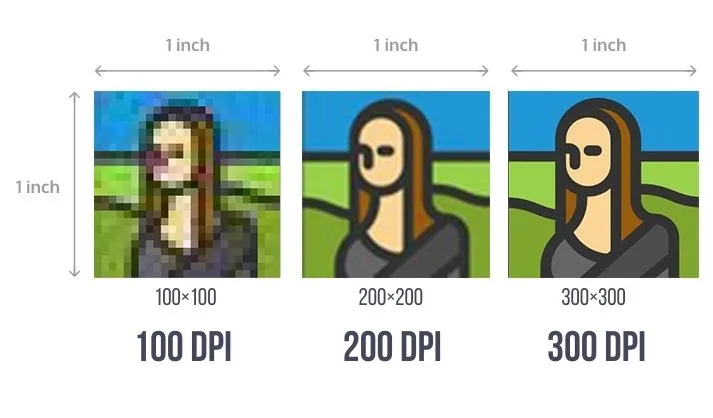
Why Transfer your Design in 300 DPI PDF File?
When preparing your hardcover book design for print, one of the most critical technical considerations is the file format and resolution. Specifically, transferring your design as a 300 DPI (dots per inch) PDF file is highly recommended and often required by professional printers. Here’s why this standard is so important:
Superior Print Quality
The primary reason for using a 300 DPI resolution is the exceptional print quality it provides:
-
300 DPI ensures that your images and text appear crisp and clear in print.
-
This resolution closely matches the capabilities of most professional printing equipment.
-
It prevents pixelation or blurriness that can occur with lower resolutions.
Industry Standard
300 DPI has become the industry standard for print-ready files:
-
Most professional printers require this resolution for optimal results.
-
It ensures consistency across different printing services and equipment.
-
Using this standard streamlines the printing process and reduces potential issues.
Detail Preservation
High resolution preserves the fine details of your design:
-
Intricate graphics, small text, and subtle color gradients are accurately reproduced.
-
It allows for the faithful representation of complex design elements.
-
Fine lines and delicate patterns remain sharp and distinct.
Color Accuracy
300 DPI files can more accurately represent colors:
-
Higher resolution allows for more precise color information per inch.
-
This leads to smoother color transitions and more accurate color matching.
-
It’s particularly important for designs with subtle color variations or gradients.
Flexibility in Sizing
High-resolution files offer more flexibility:
-
They can be scaled down without losing quality, useful for creating smaller versions of your design.
-
This is beneficial if you need to repurpose your cover design for marketing materials or different formats.
PDF Format Benefits
Choosing PDF as the file format offers several advantages:
-
PDFs are universally compatible across different operating systems and software.
-
They maintain the integrity of your design, including fonts and layout.
-
PDFs can embed all necessary information, reducing the risk of missing elements.
Print-Ready Files
300 DPI PDFs are typically considered print-ready:
-
This format often requires minimal adjustments from the printer.
-
It reduces the likelihood of errors or misinterpretations in the printing process.
-
Many printers prefer or require this format, streamlining the production workflow.
Consistent Viewing
PDFs ensure consistent viewing across different devices:
-
The design appears the same regardless of the software used to open it.
-
This consistency is crucial when sharing designs with team members or clients.
File Size Management
While 300 DPI files are larger than lower resolutions, PDFs help manage file size:
-
PDFs can compress data without significant loss of quality.
-
This makes it easier to transfer large, high-resolution designs.
Color Space Compatibility
PDFs support various color spaces:
-
You can embed color profiles to ensure accurate color reproduction.
-
This is particularly important for maintaining consistency between screen and print.
Layered File Support
Modern PDFs can support layered files:
-
This allows for easier editing and adjustments if needed.
-
Printers can access individual elements of the design if necessary.
Prepress Compatibility
300 DPI PDFs are ideal for prepress processes:
-
They integrate well with professional prepress software and workflows.
-
This ensures smooth transition from design to plate-making in offset printing.
Archival Quality
High-resolution PDFs serve as excellent archival copies:
-
They preserve the quality and details of your original design.
-
This is valuable for long-term storage and potential future use.
Printing your hardcover book with BookPrintingChina
When it comes to bringing your hardcover book design to life, choosing the right printing partner is crucial. BookPrintingChina offers a comprehensive and professional service tailored to meet the needs of authors and publishers seeking high-quality hardcover book printing.
When you choose us for your hardcover book printing needs, you’ll be working with a company that combines technical expertise, quality assurance, and customer-focused service. Our comprehensive approach ensures that your hardcover book will not only meet your expectations, but likely exceed them, resulting in a professional, high-quality product that you can be proud to share with your readers.